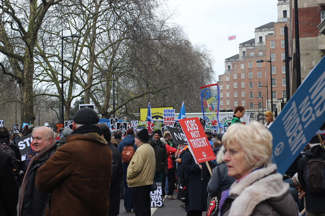
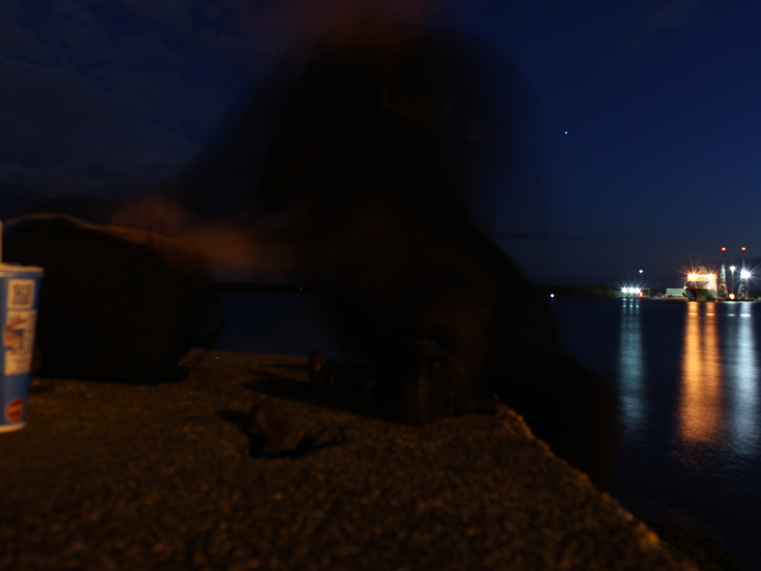
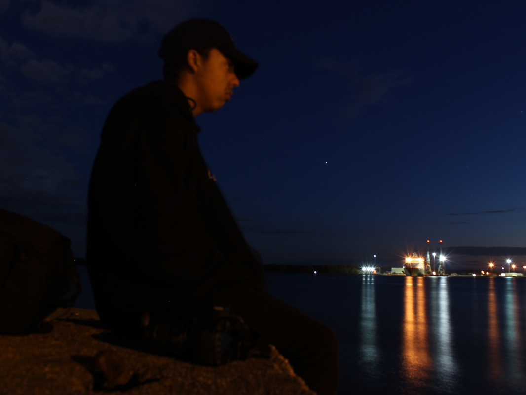
Photo shoot 1

Best 3 images.
|

|
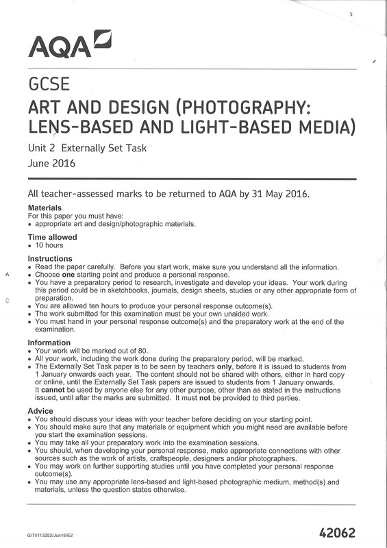
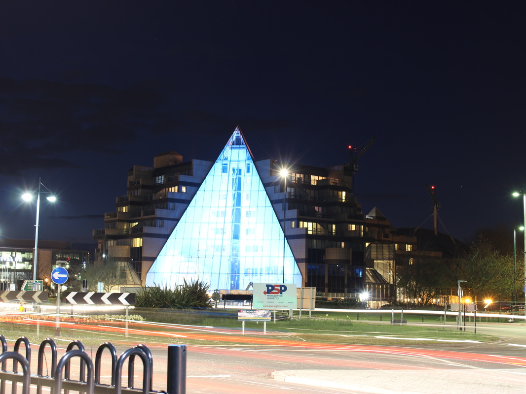
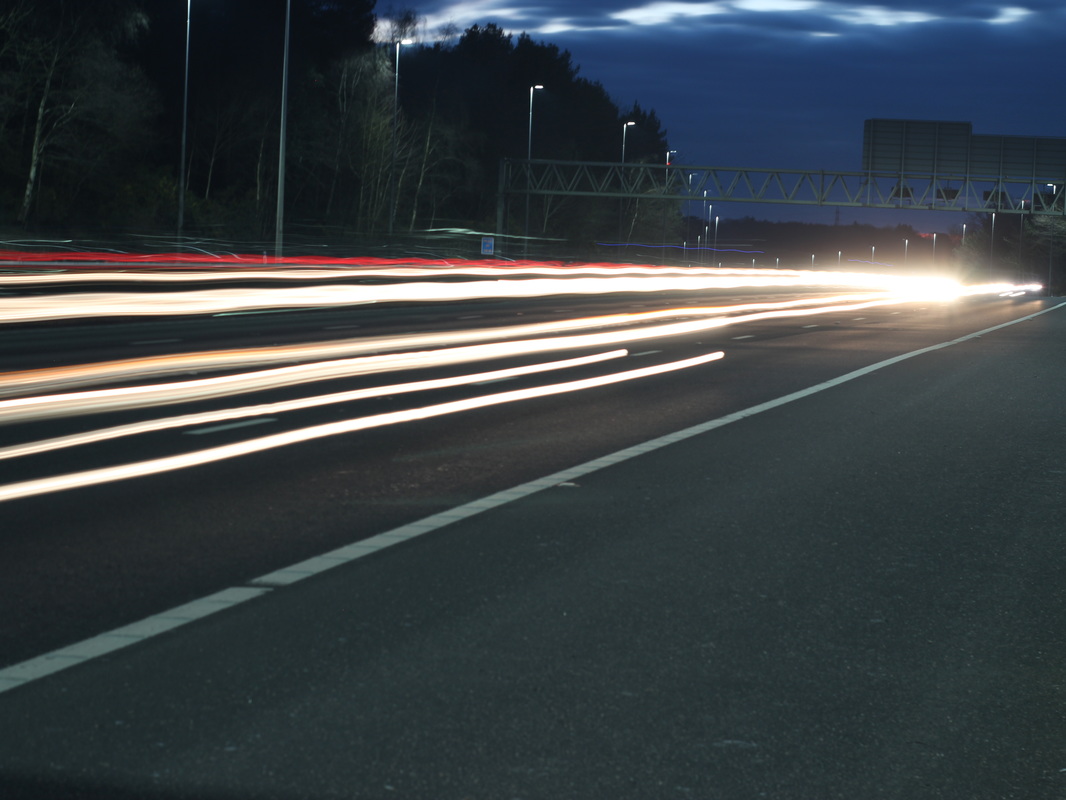
There was only a few steps to edit this, here they are:
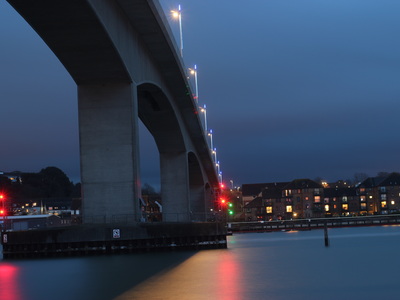
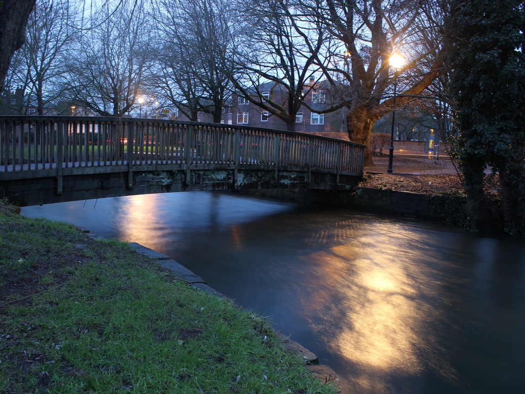
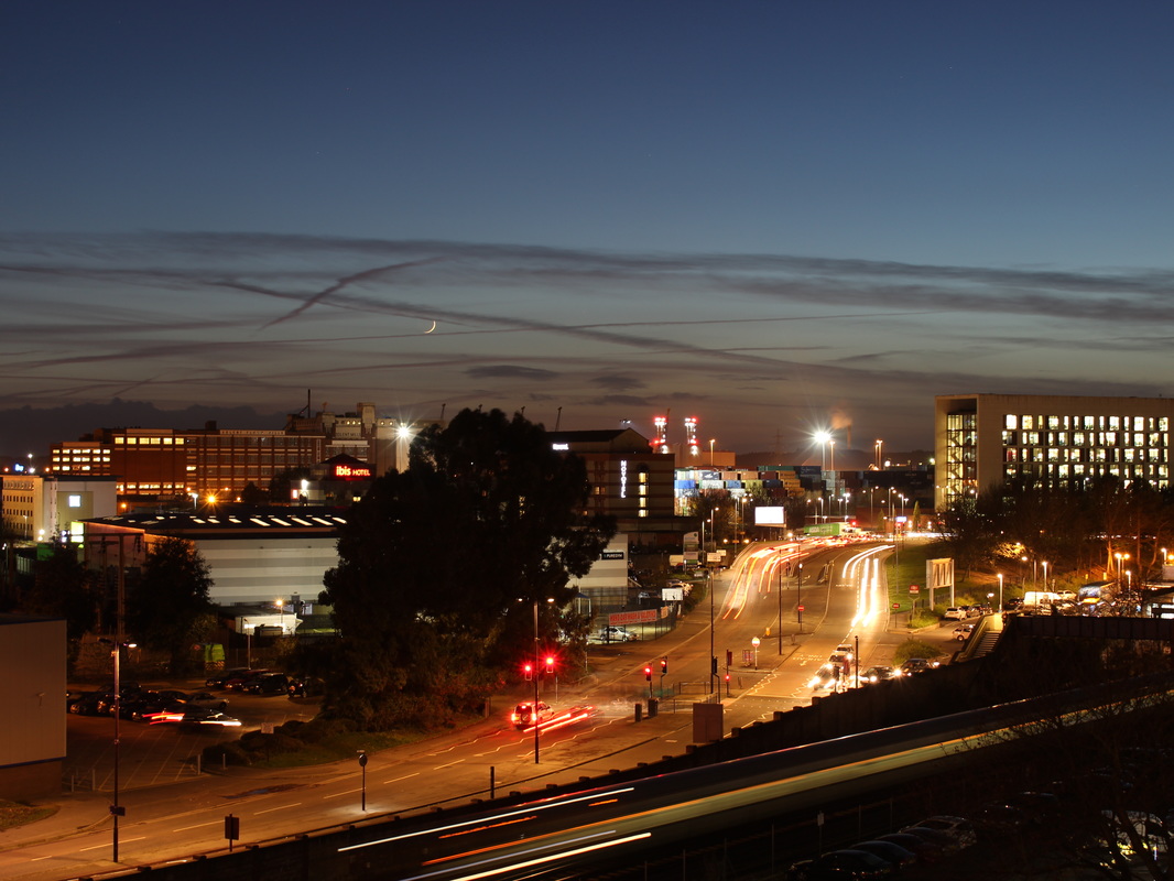
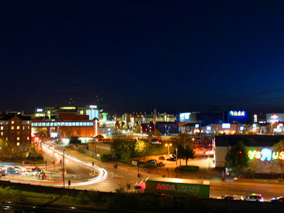
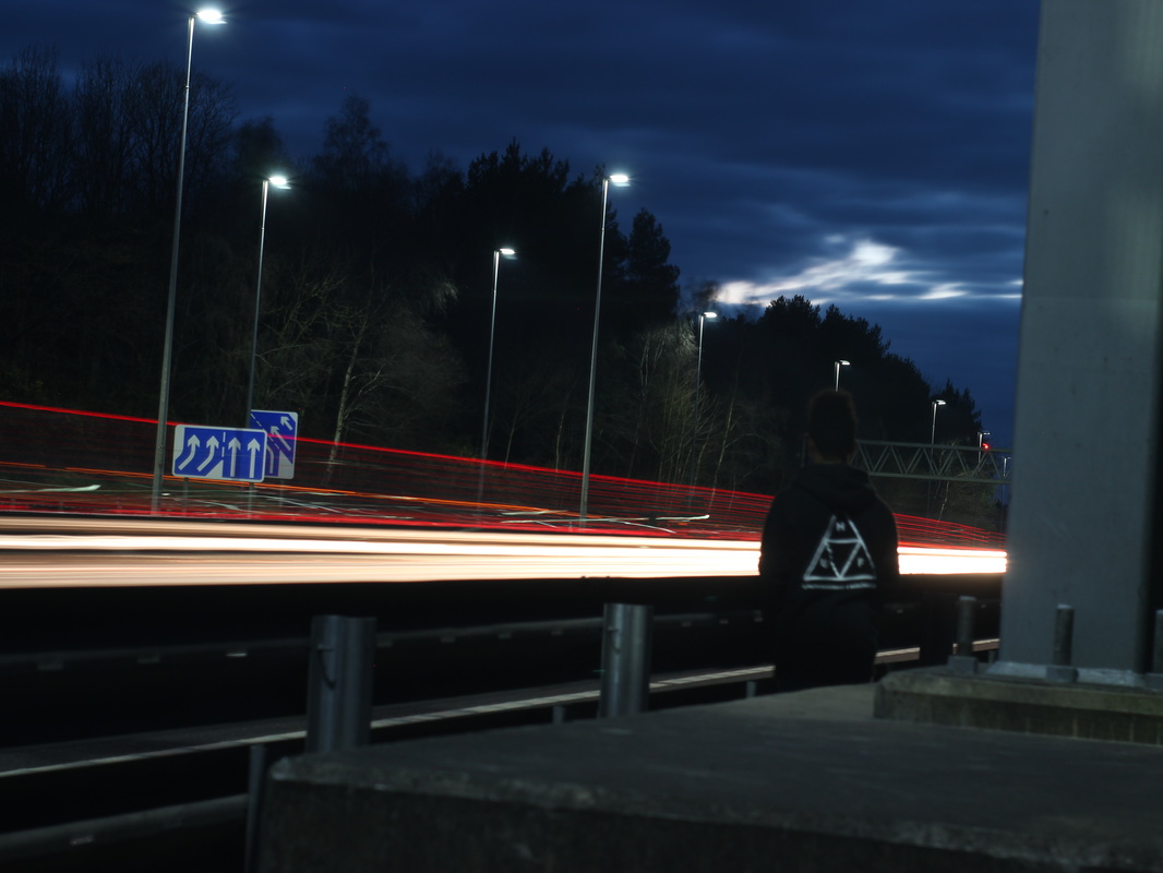
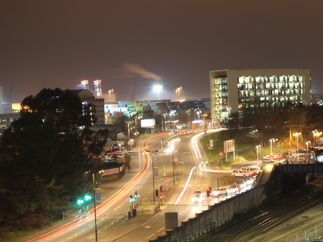
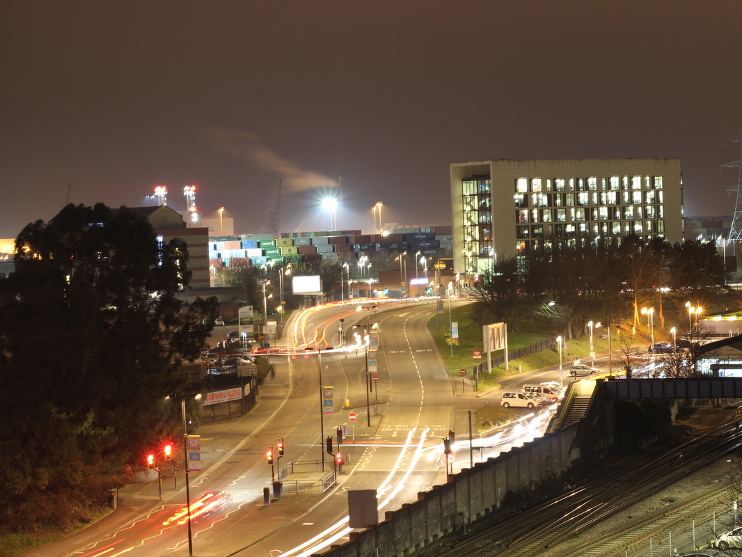
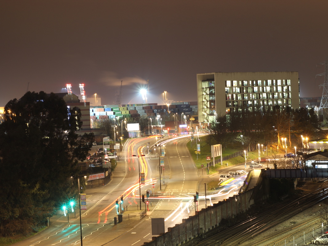
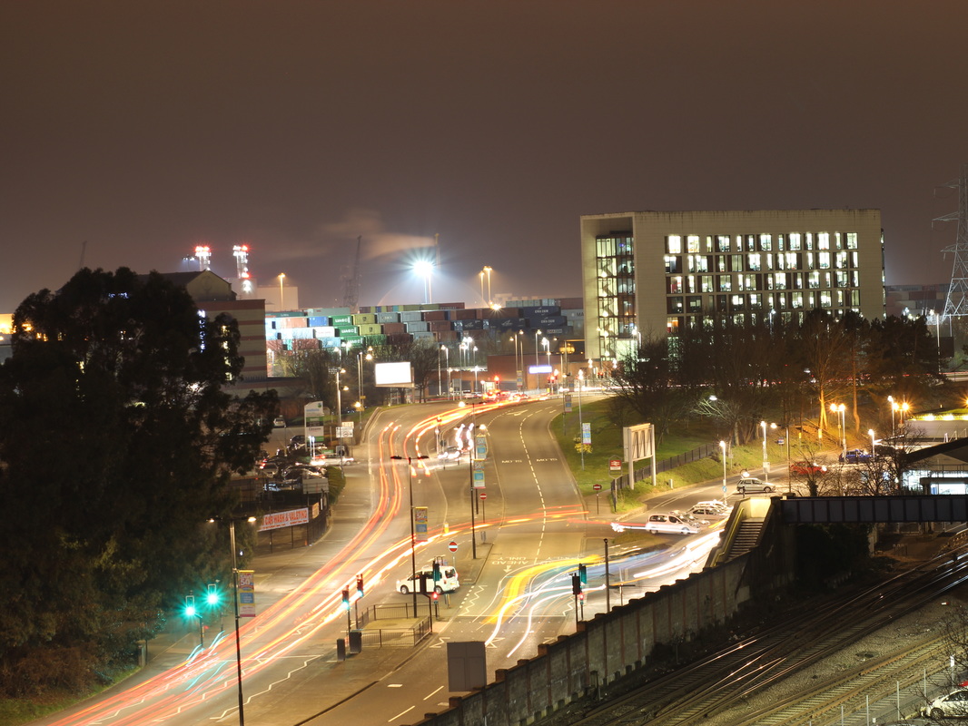
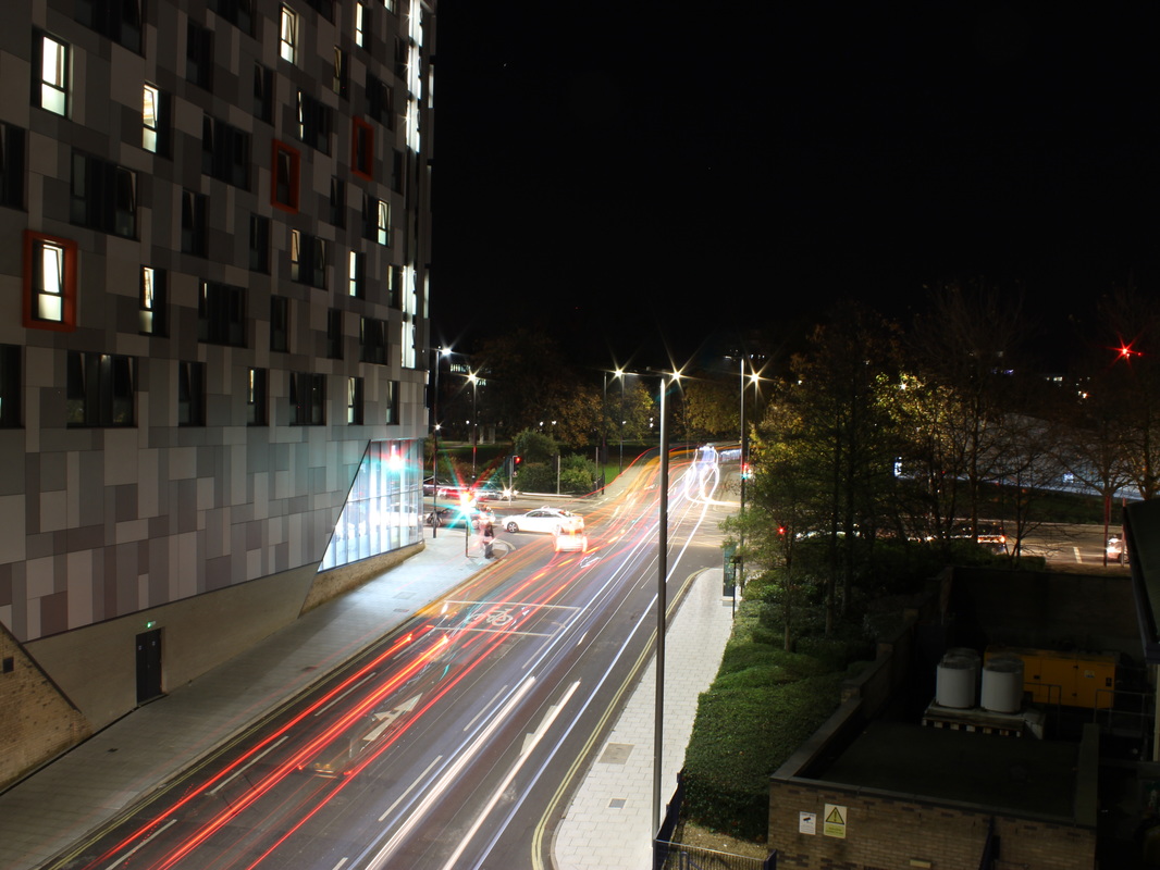
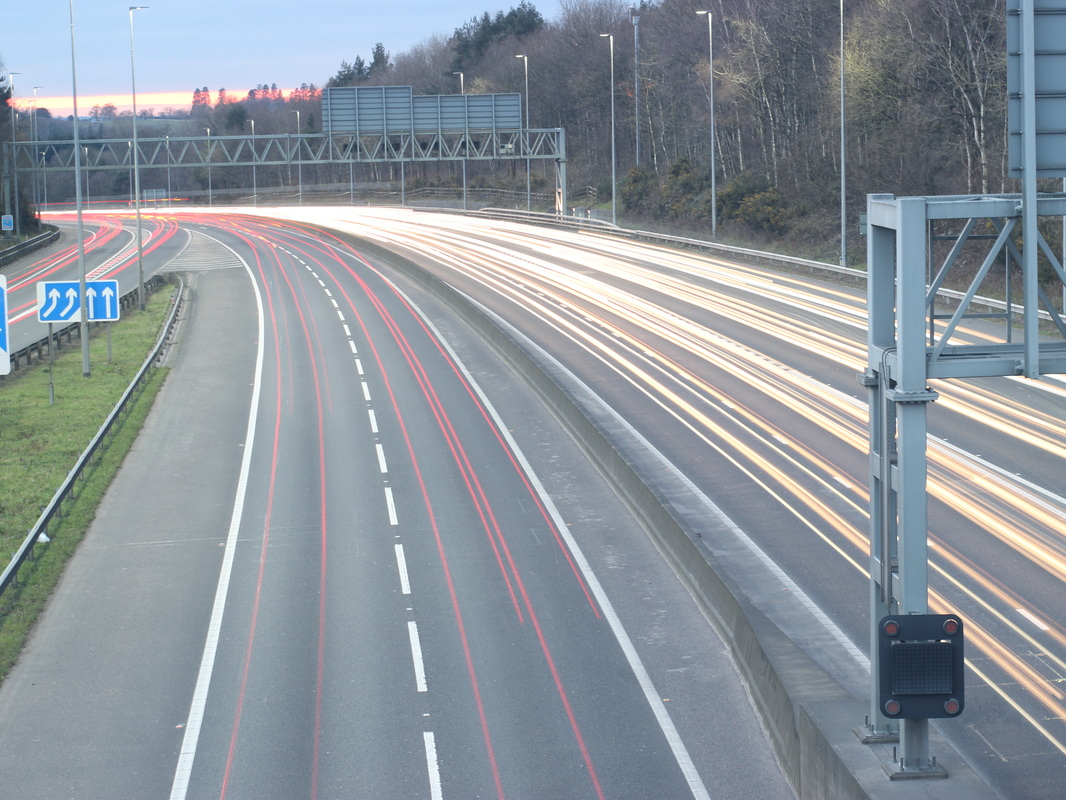
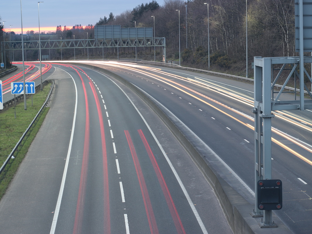
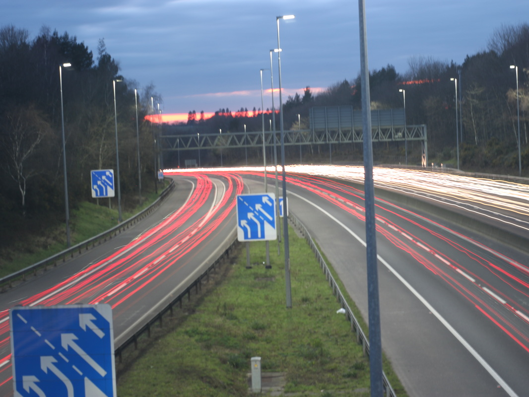
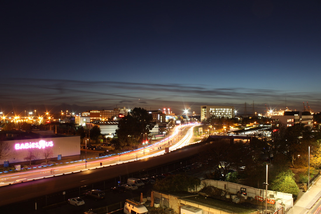
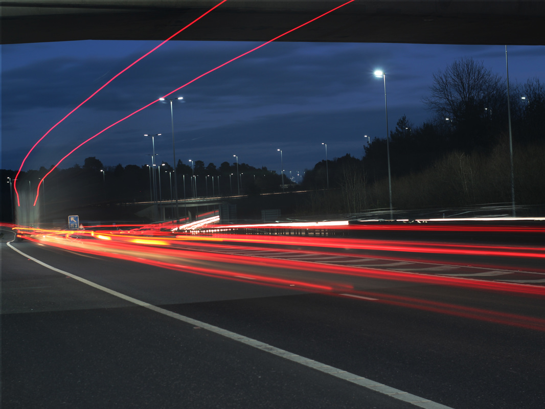
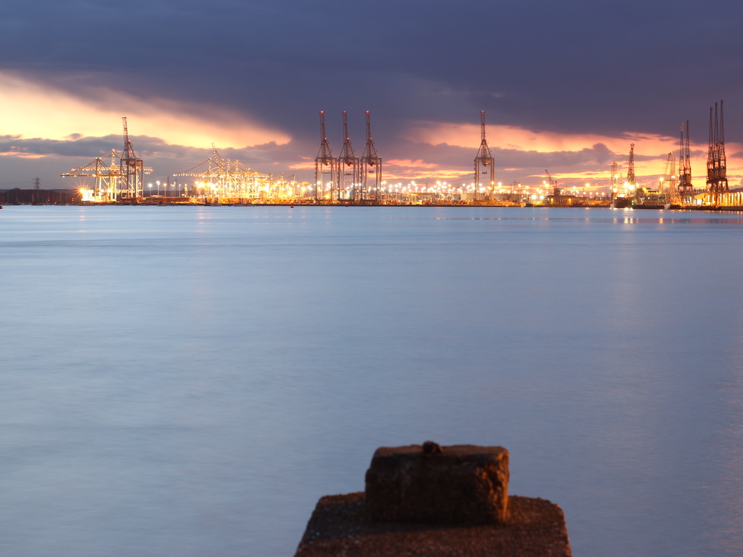
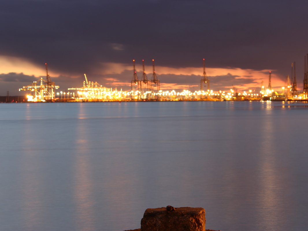
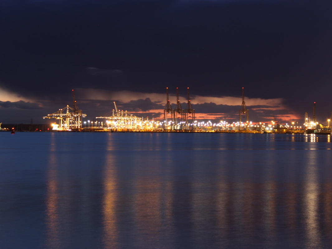
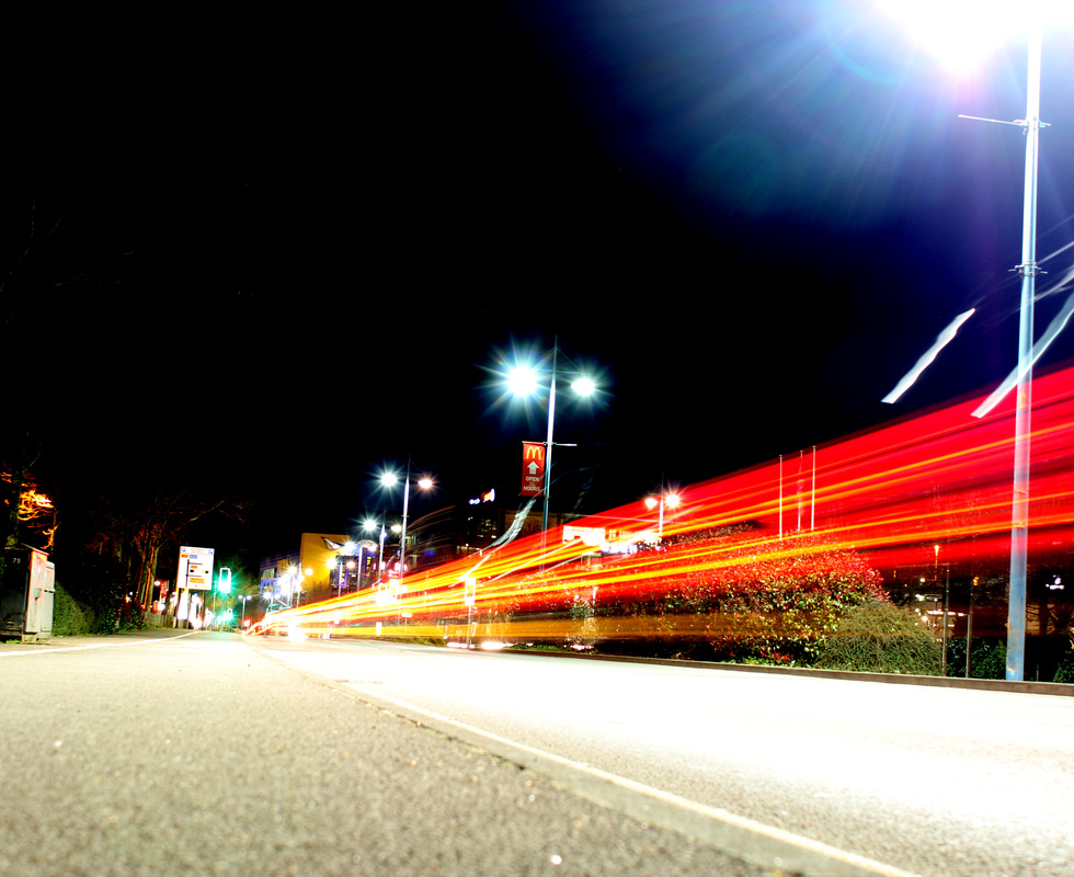
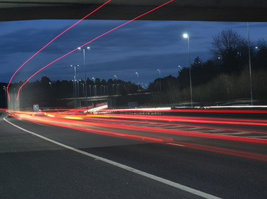
step 1:firstly I adjusted the levels to make some bits on the image darker, as its a night time image I wanted it to be a bit darker. Step 2: I adjusted the colour balance to make it a bit darker and vibrant just so the lights stand out a bit more. |

|
|
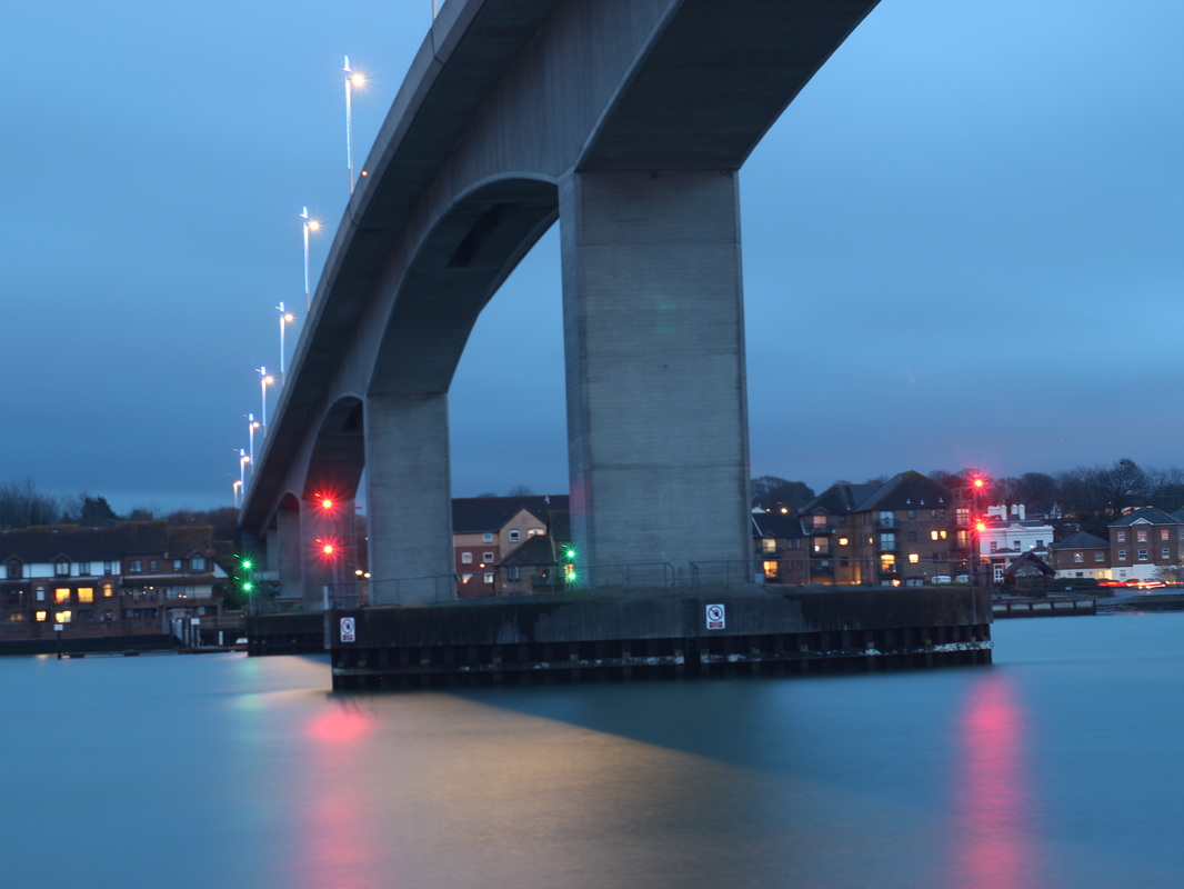
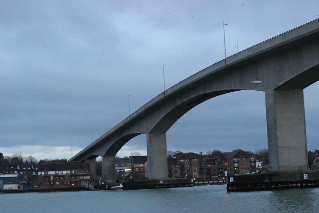
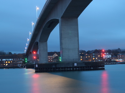
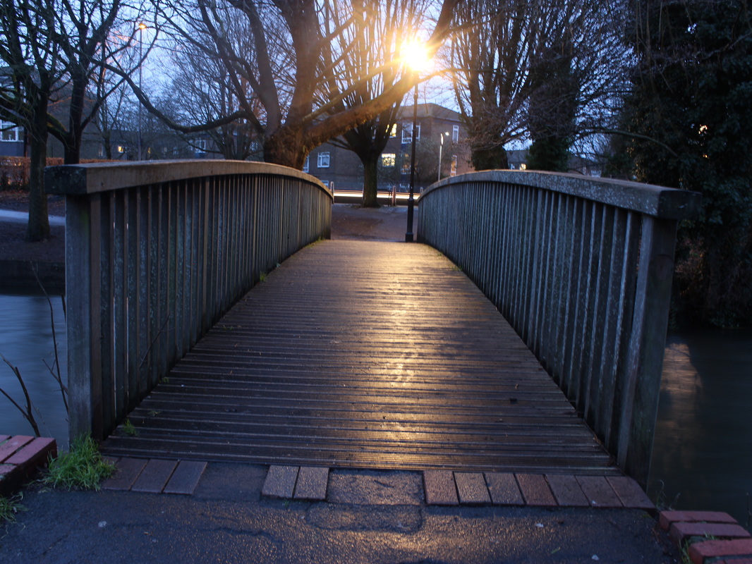
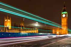
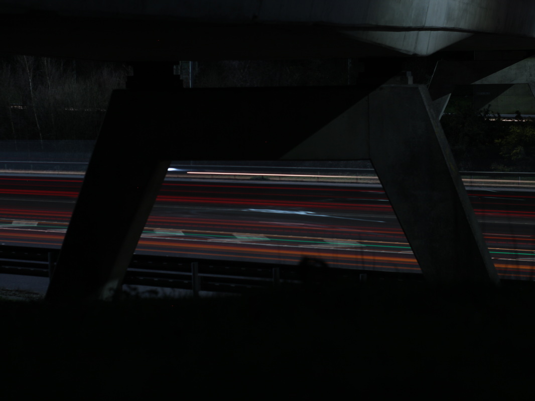
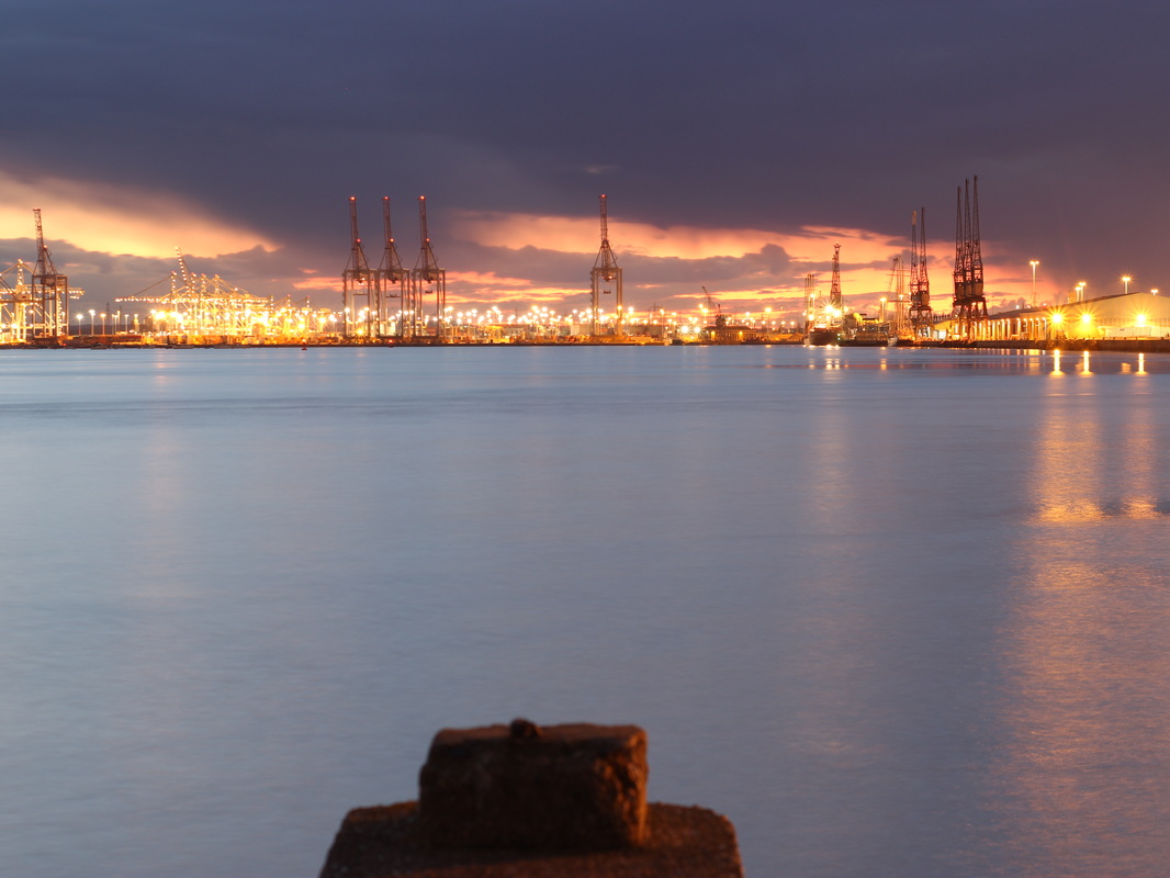
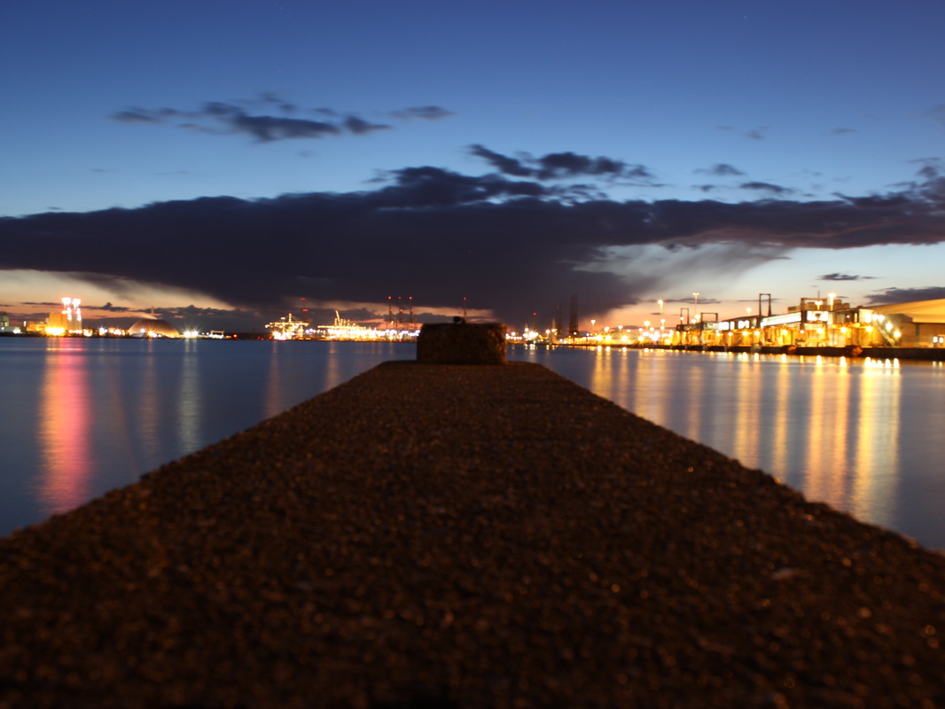
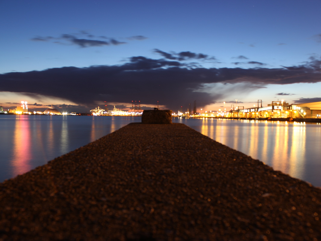
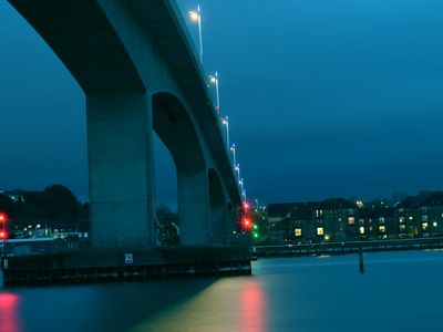
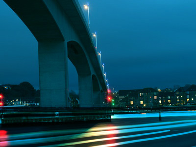
Step 1: I cropped the sides of the image to make the bridge central in the image.
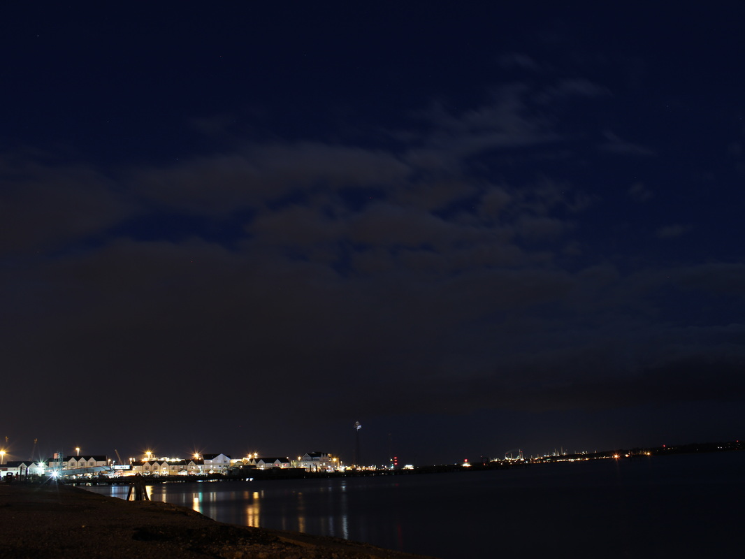
step 2: I then adjusted the exposure so there is more light under the bridge, so its not so dark and gloomy. step 3: I then adjusted the colour balance to adjust the colour of the water and concrete colour of the bridge. Step 4 : I then adjusted the vibrancy to make all the colours more vibrant and less gloomy. step 4 : finally I added a blue filter to make the water and sky look more blue. |
|
|
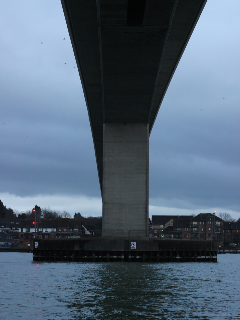
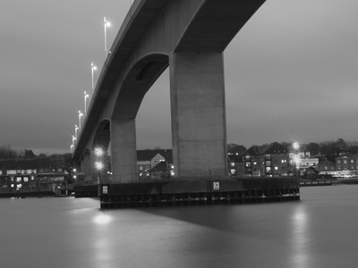
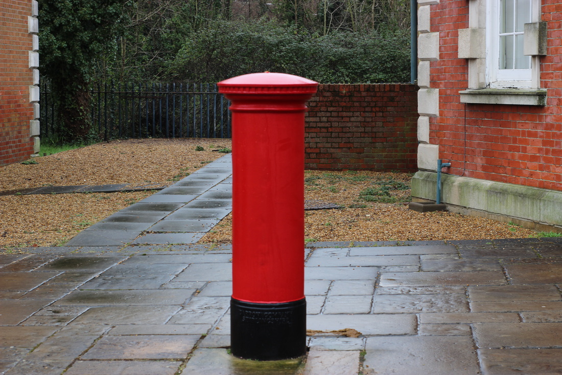
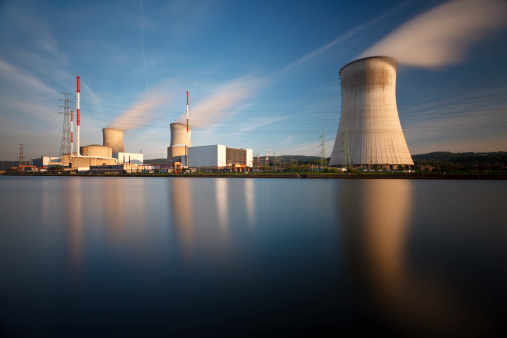
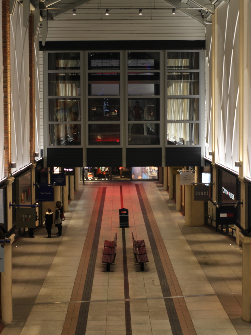
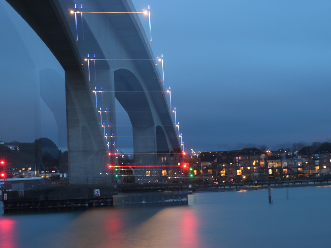
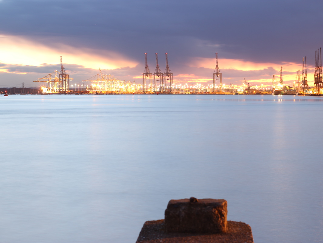
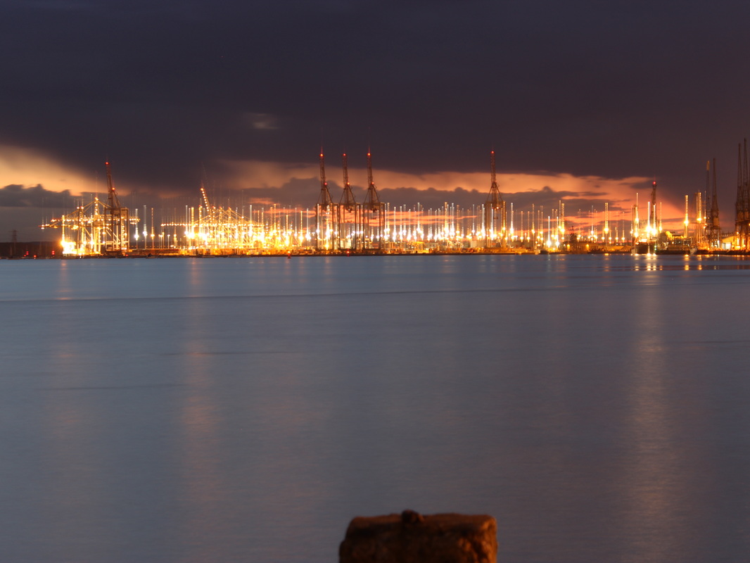
For this image I only did 2 things here is what I did:
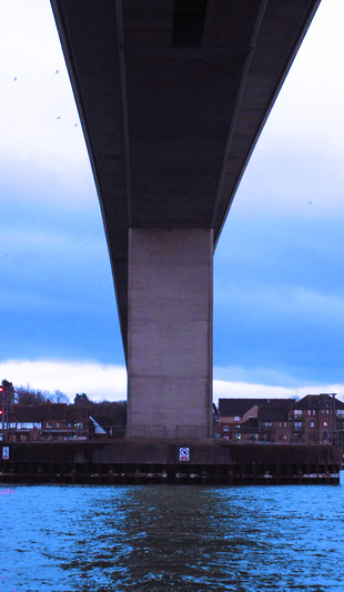
Step 1: I put the image into black ad white and adjusted the colours to make the water have more shadows. Step 2: I then adjusted the levels to give more contrast between the bridge and the water. |
Photo shoot 2
My Best three images.


|
|
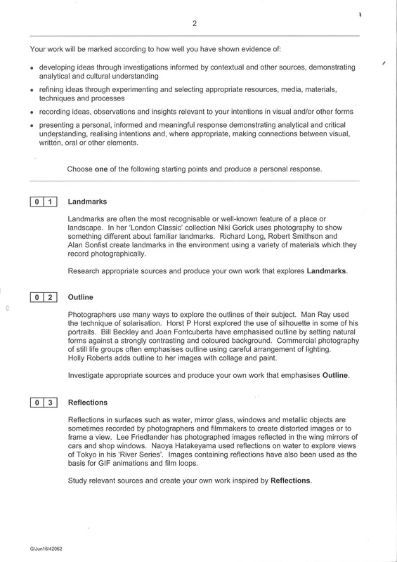
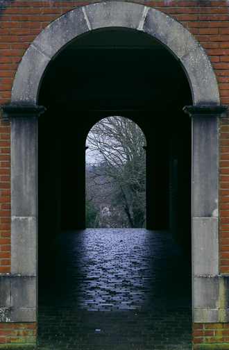
I edited this image in a few steps here is how I did it:
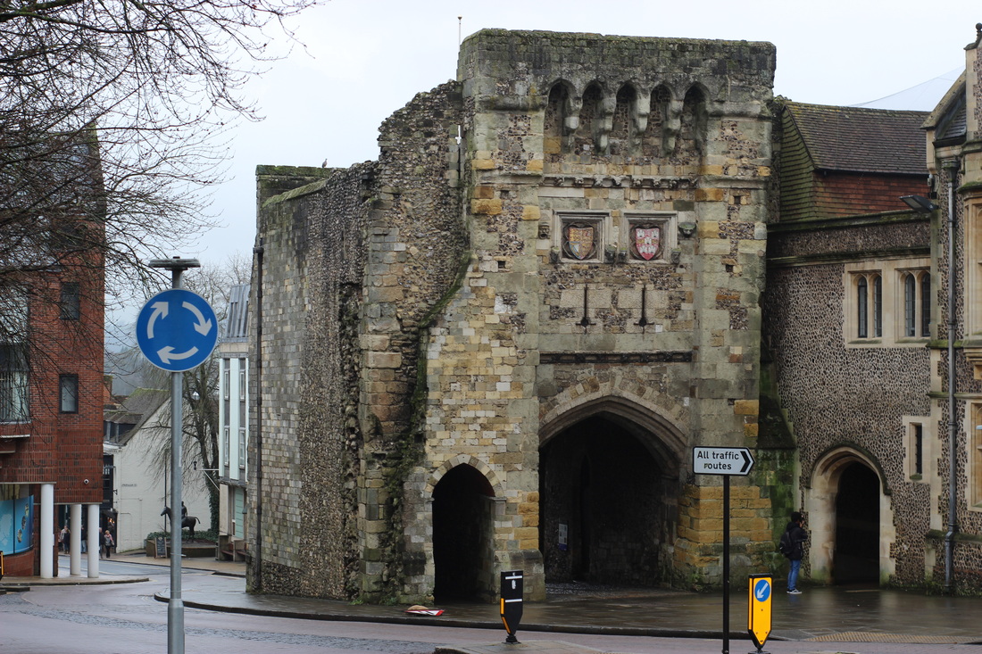
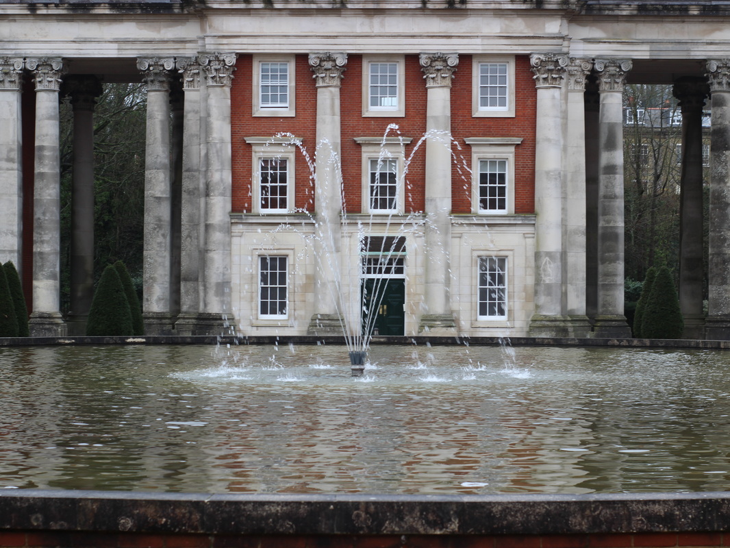
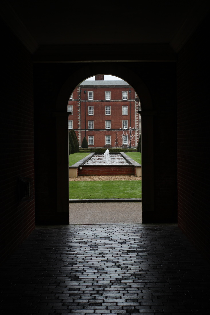
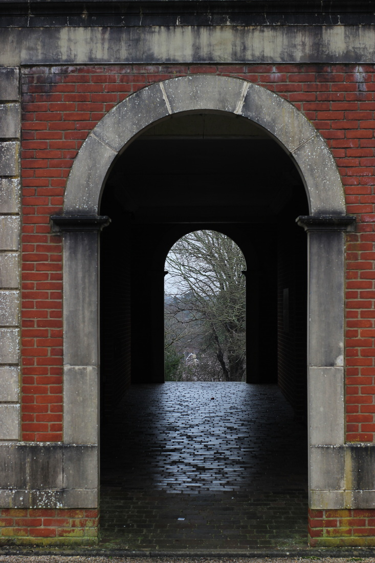
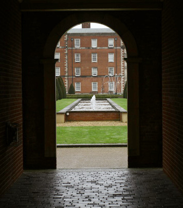
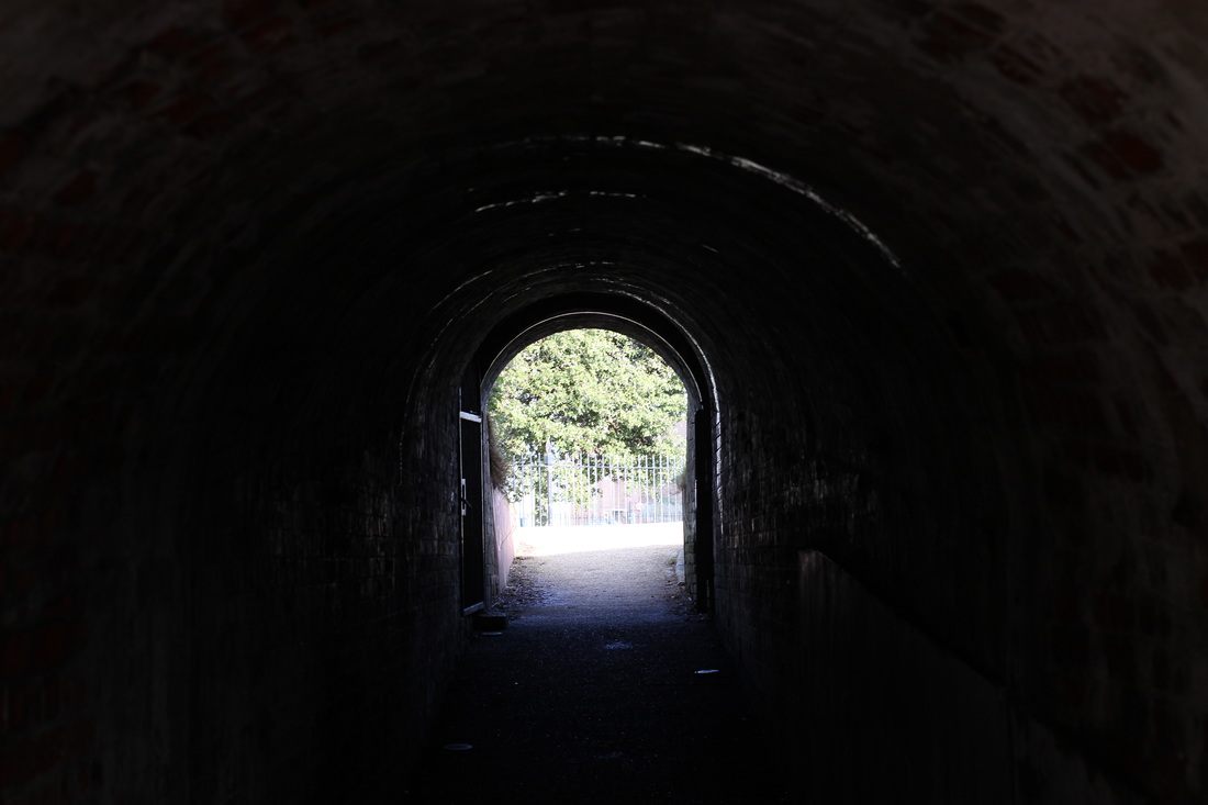
step 1: I cropped the image to make the arch way central in the image so its the main focus as its the landmark. Step 2: After this edited the Hue/Saturation to make the colours colder and to make it gloomier. step 3: Finally I edited the colour balance to make the green from the moss more vibrant and the red from the bricks dull. For this image there was a lot of editing steps this is what I done:
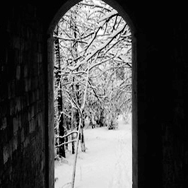
Step 1: firstly I took the original image and adjusted the levels to make the inside of the tunnel lighter so its not so dark inside. step 2: After that I used the polygon lasso tool to draw around the background at the end of the tunnel, once I done that I deleted it so it was an empty background. Step3: I got an image off of Google and placed it behind the image to create a more scenic background. Step 5: I adjusted the levels on the back ground image to make the lighting match a bit better. |
|
|
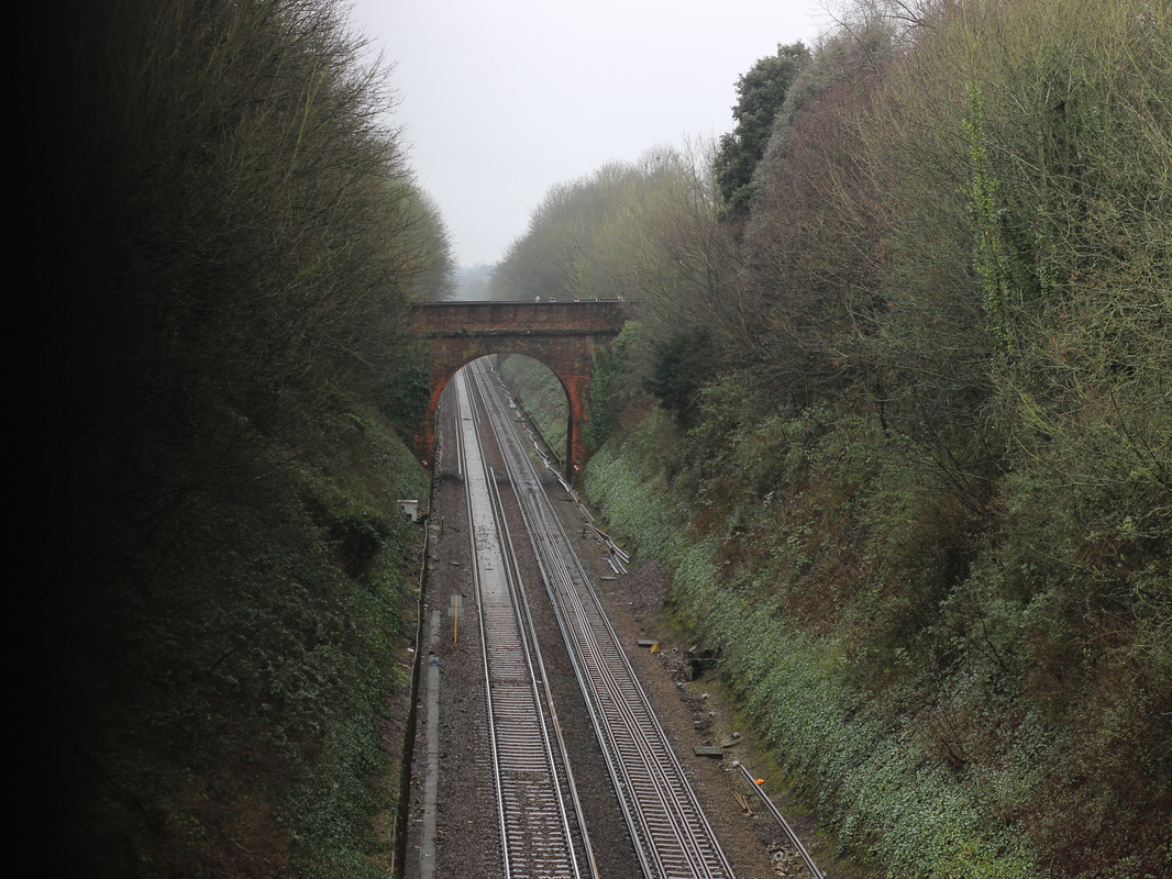
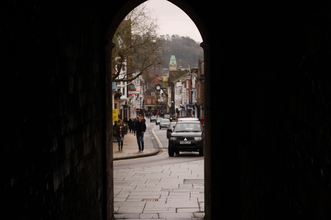
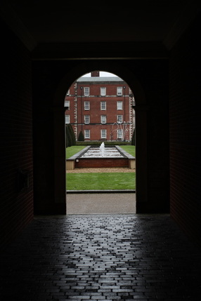
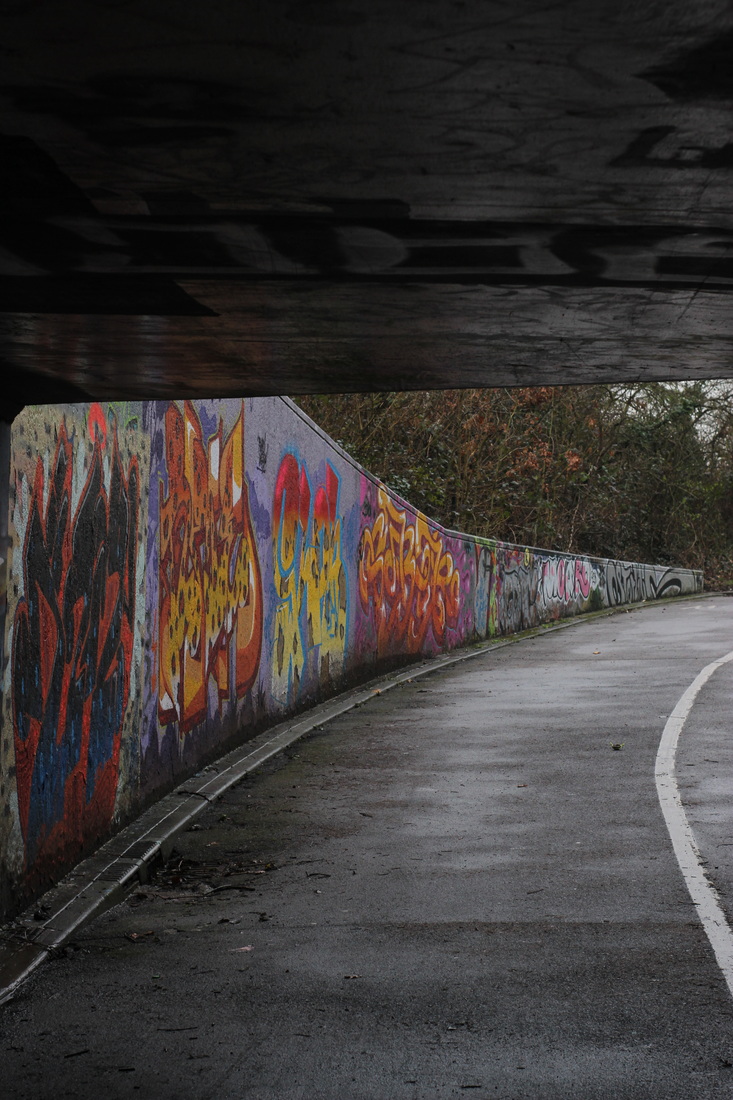
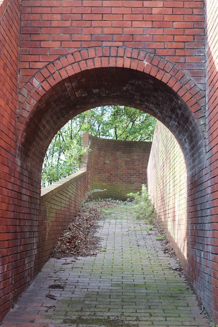
for this image I took a few steps here is what I done:
Step 1: firstly I cropped the sides of the image to make the arch more central in the image and to make it the main focus. Step 2: then I adjusted the levels to make the inside of the tunnel lighter so you can see the patterns on the ground and walls. Step 3: finally I adjusted the colour balance to make the red on the bricks more vibrant and the grass greener. |
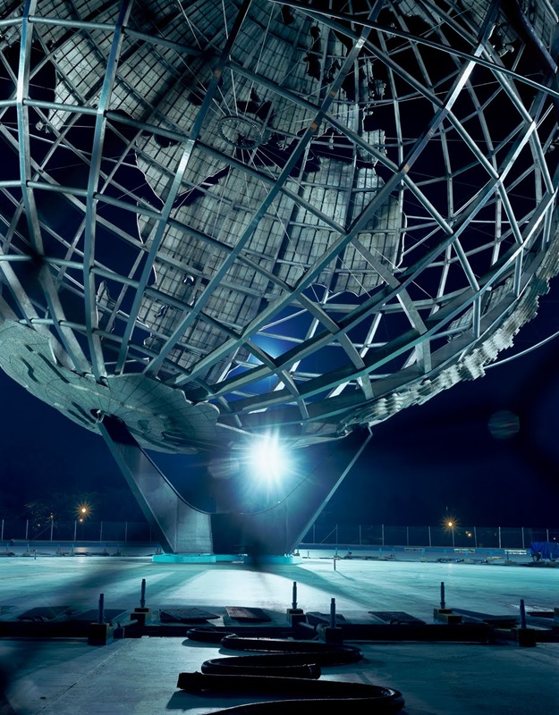
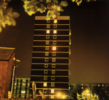
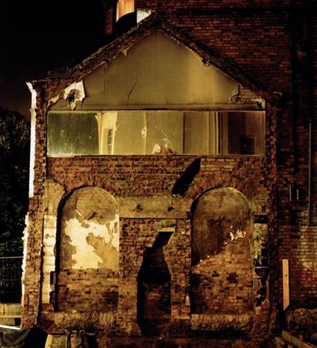
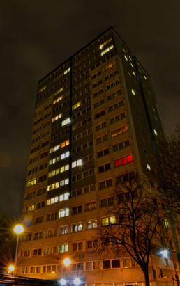
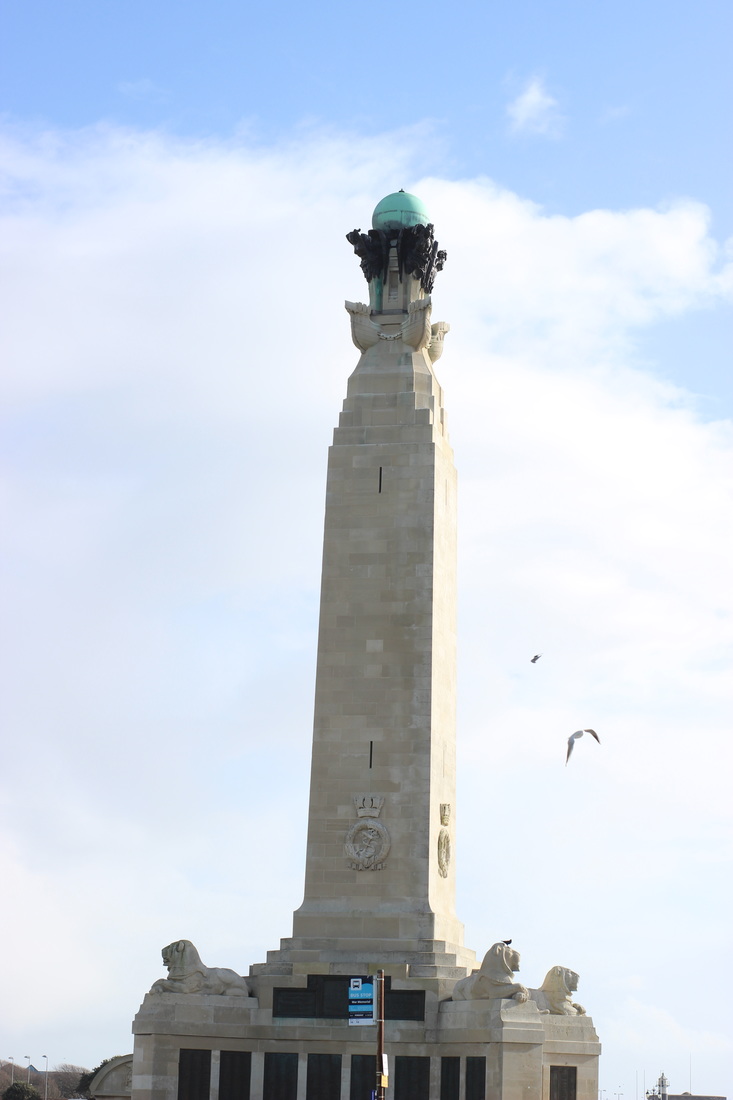
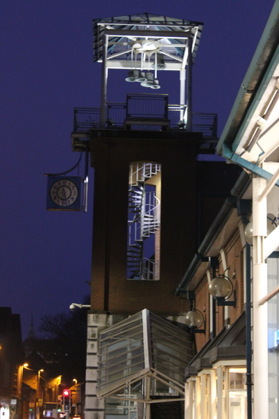
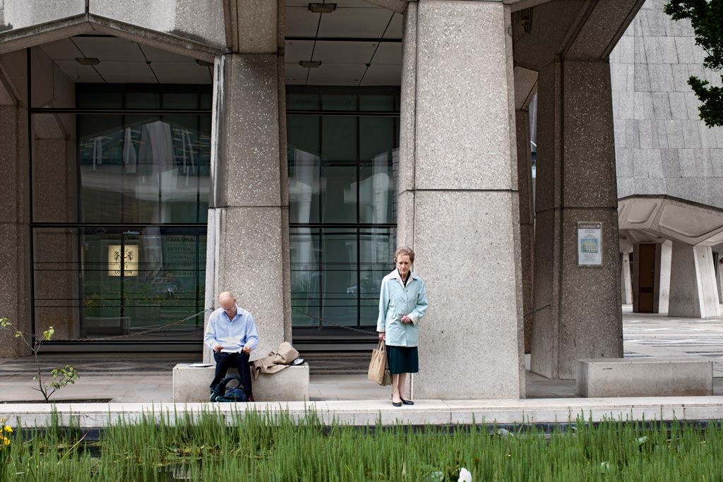
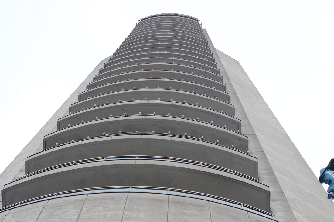
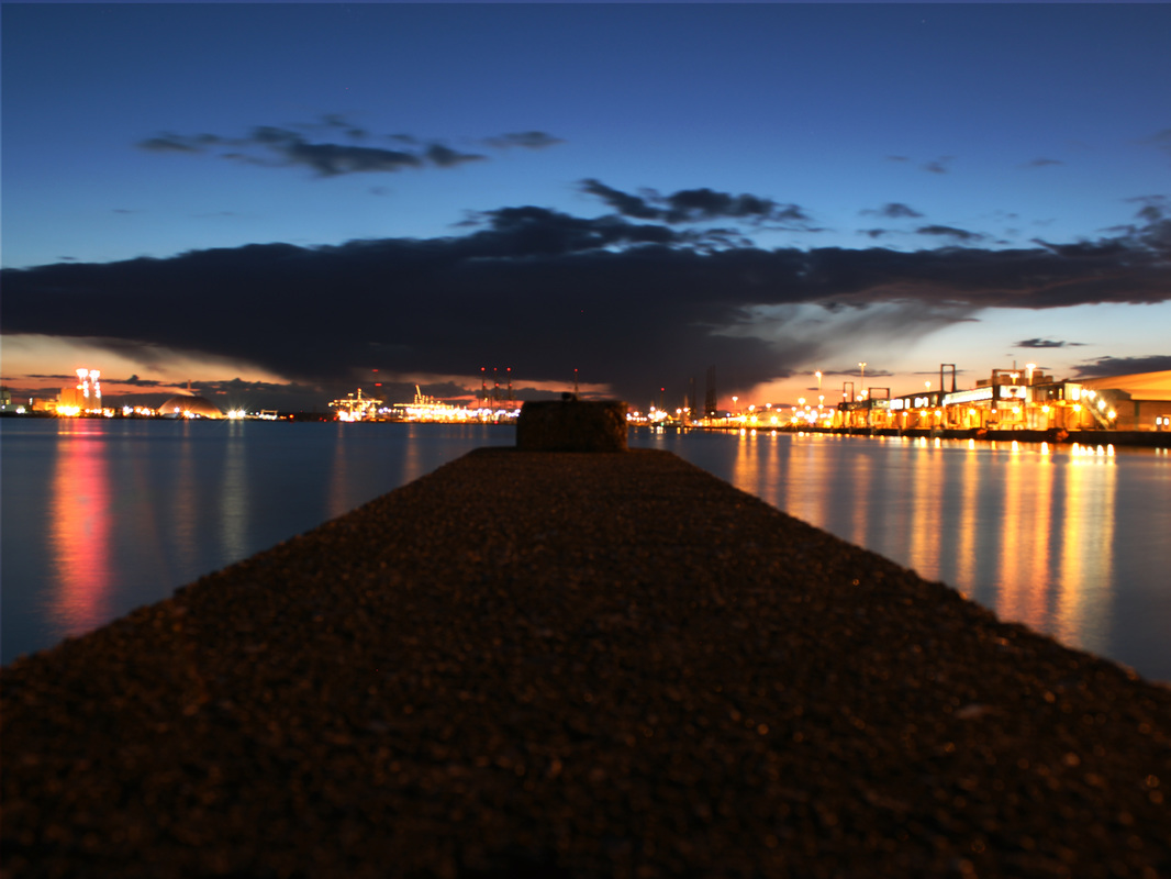
Rut Blees Luxemburg
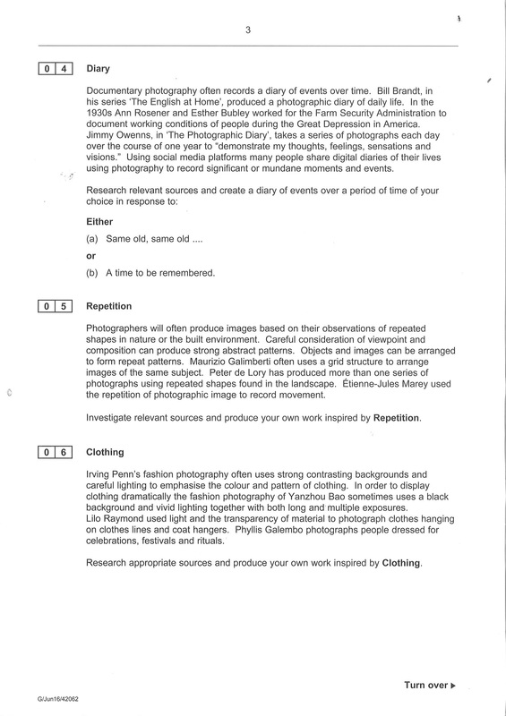
Rut Blees Luxemburg is a German photographer. Her technique is to take photographs at night, mostly exploring the urban landscape. I like her work because it is a unique way to photograph the urban landscape and capture the night time in a photograph .

|
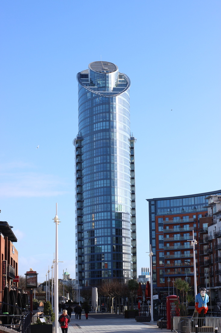
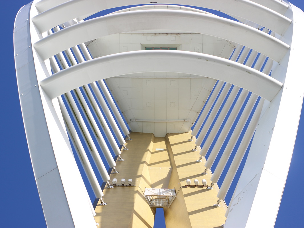
I like this photo the most because of how creative the photographer was by making a normal everyday sight interesting and unique. The low angle shot emphasises the height of the tower making it look never ending and the perspective lines draw you to the top of the image . Also the darkness of the night makes the tower fade into the dark sky making it look like it reaches the sky. Also the strong rectangle shaped lights along the tower create a pattern along the face and sides of the tower.
|
My Response to Rut Blees Luxemburg.


My best 3 images.
|
|
For this image I took a few steps.
Step 1: I adjusted the levels to make it darker in some parts and lighter in others to make it more like Rut blees luxembergs work. step 2: I adjusted the hue and saturation to make the colours dull. |

|
|
For this image I took a few steps.
step 1 : I adjusted the hue and saturation to change the colours in the image. step 2: I put in black and white to make it darker. |
|
|
for this image I took one step.
Step 1: I adjusted the hue and saturation to make the lights more vibrant and the sky darker |
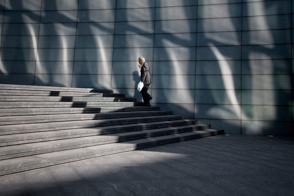
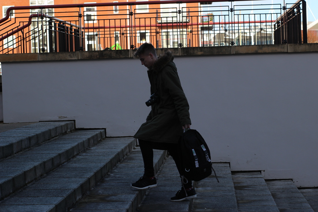
Polly Braden
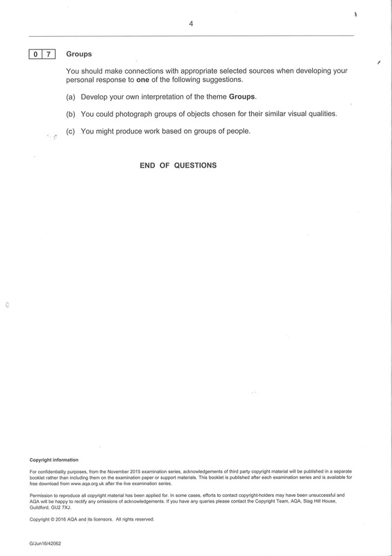
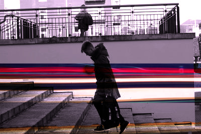
Polly Braden has become renowned for her documentary photography exploring the relationship between everyday life, work, leisure and economics. Searching for small and telling gestures her images are acutely observed portraits and broader assessments of contemporary culture.


|
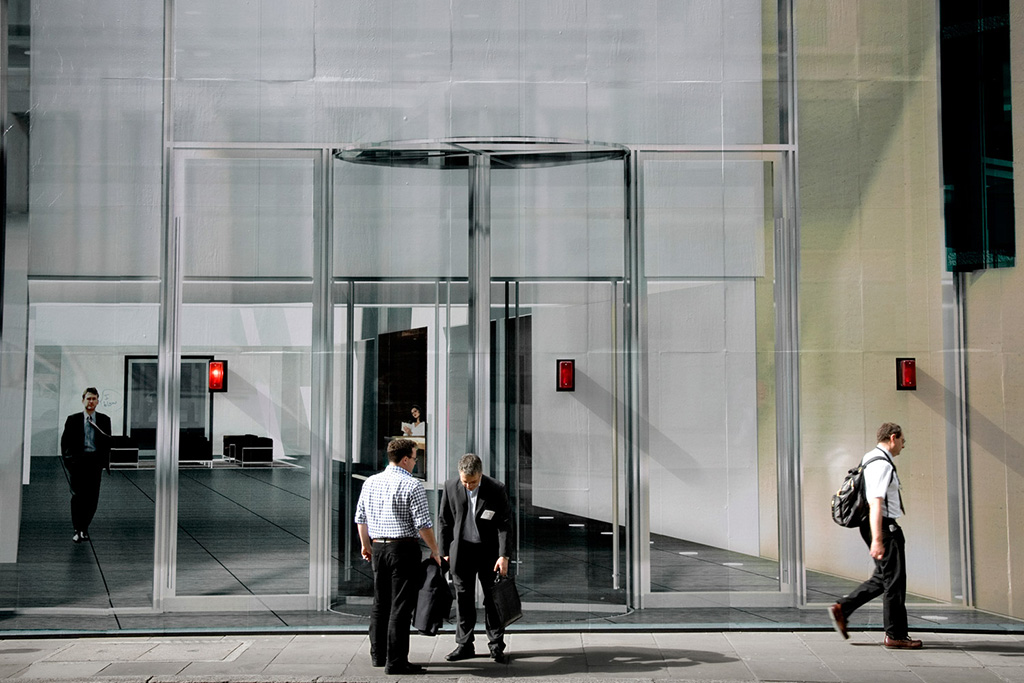
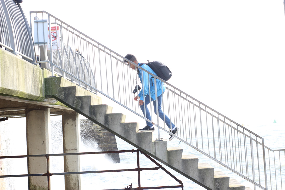
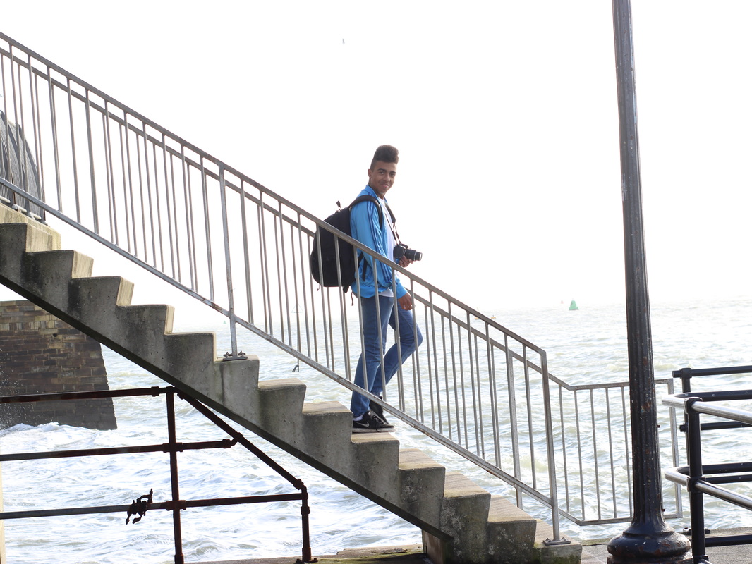
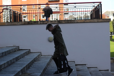
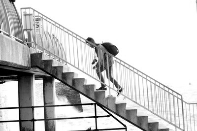
I like this picture the most because of the strong patterns throughout the image. I like the patterns created by the shadows along the far wall at the back and along the steps. The strong shadows create a repetitive pattern throughout the image. In this image there are repeated diagonal lines along the stairs, walls and shadows. The shadows and lines draw our eyes towards the steps and the man walking up them. The man gives the photo a sense of scale and shows how big his surroundings are. Finally the mans bright white bag is perfectly central in the image.
|
My Response to Polly Braden.

My Best three images.
|
|
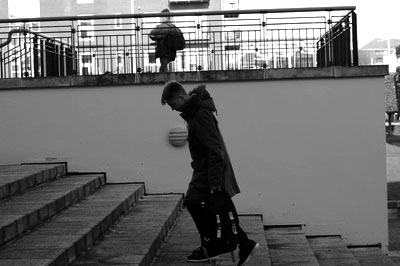
For this image I only took 2 steps.
Step 1: I put it in black and white to create a high contrast between the blacks and the whites. Step 2: I adjusted the levels to create an even greater difference in contrast. |
|
|
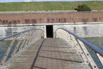
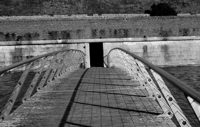
For this image I took a few steps.
Step 1: I cropped the image to make it look more even and to get rid of the sky. Step 2: I put it in black and white so it matches all the other images. Step 3: I adjusted the levels so the shadows from the railing has a greater contrast and stands out more. |

|
|
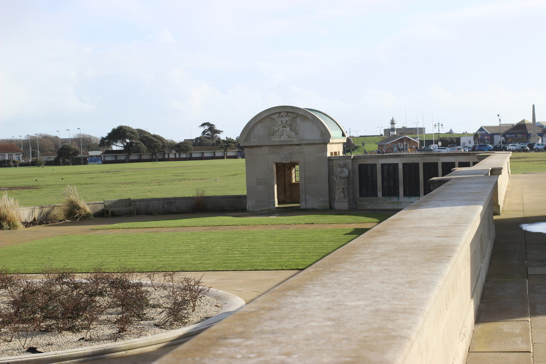
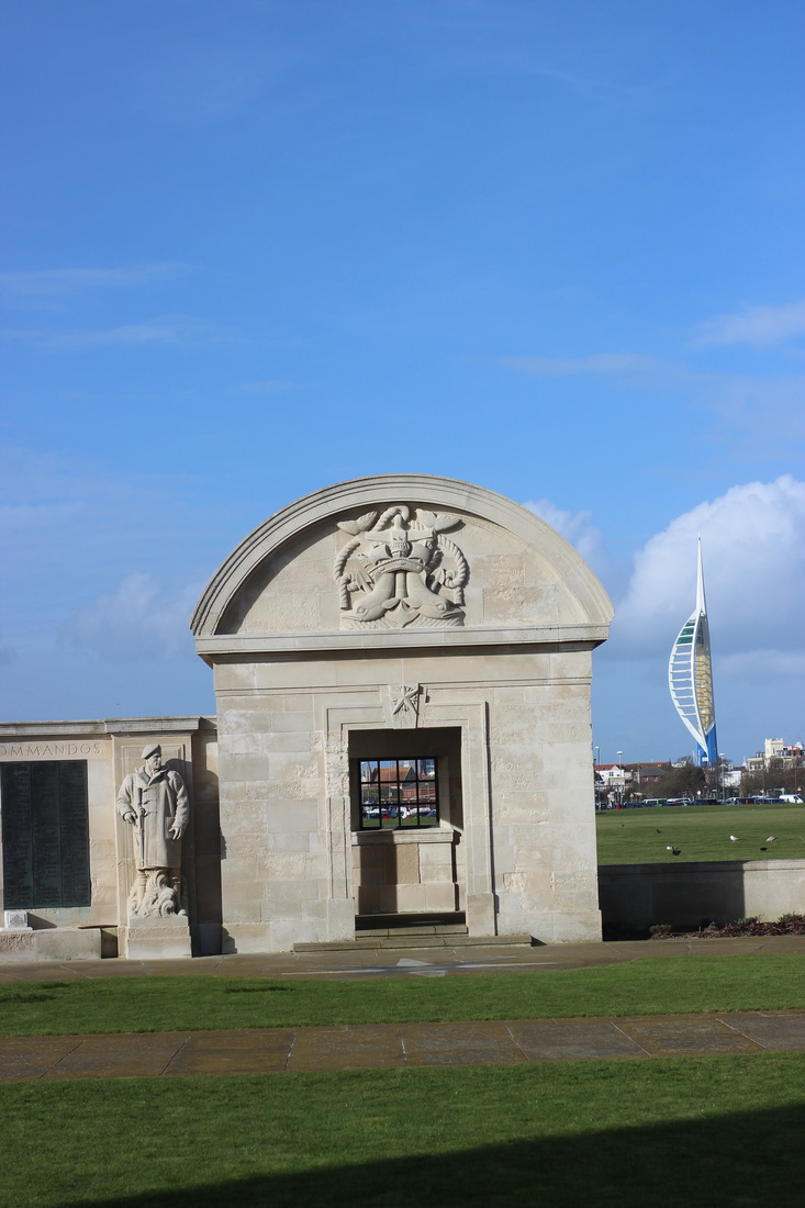
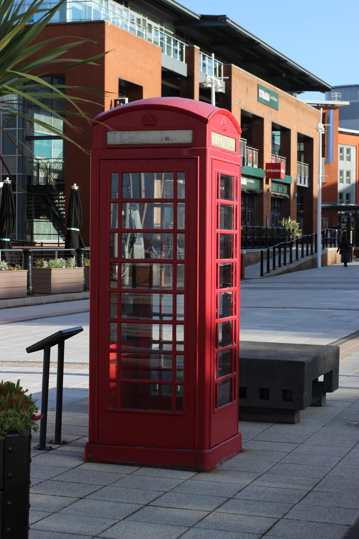
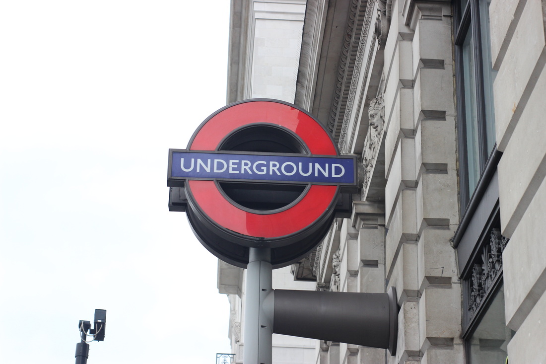
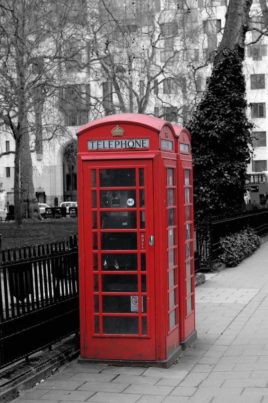
Niki Gorick
Niki Gorick takes photos of iconic landmarks around London in black white. She takes pictures from abstract angles to make things look bigger or different. She puts her images in black and white to create a high contrast in colours. She takes pictures of iconic landmarks throughout London which creates an interest in her work because they are well known.
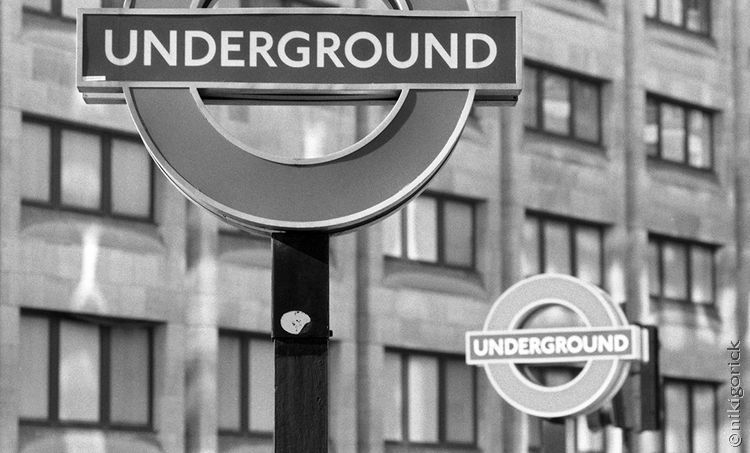
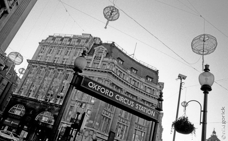
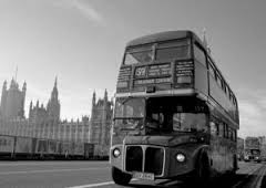
My response to Niki Gorick
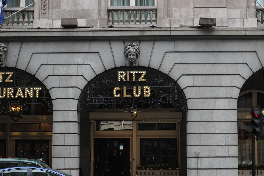

My best three images.

|
|
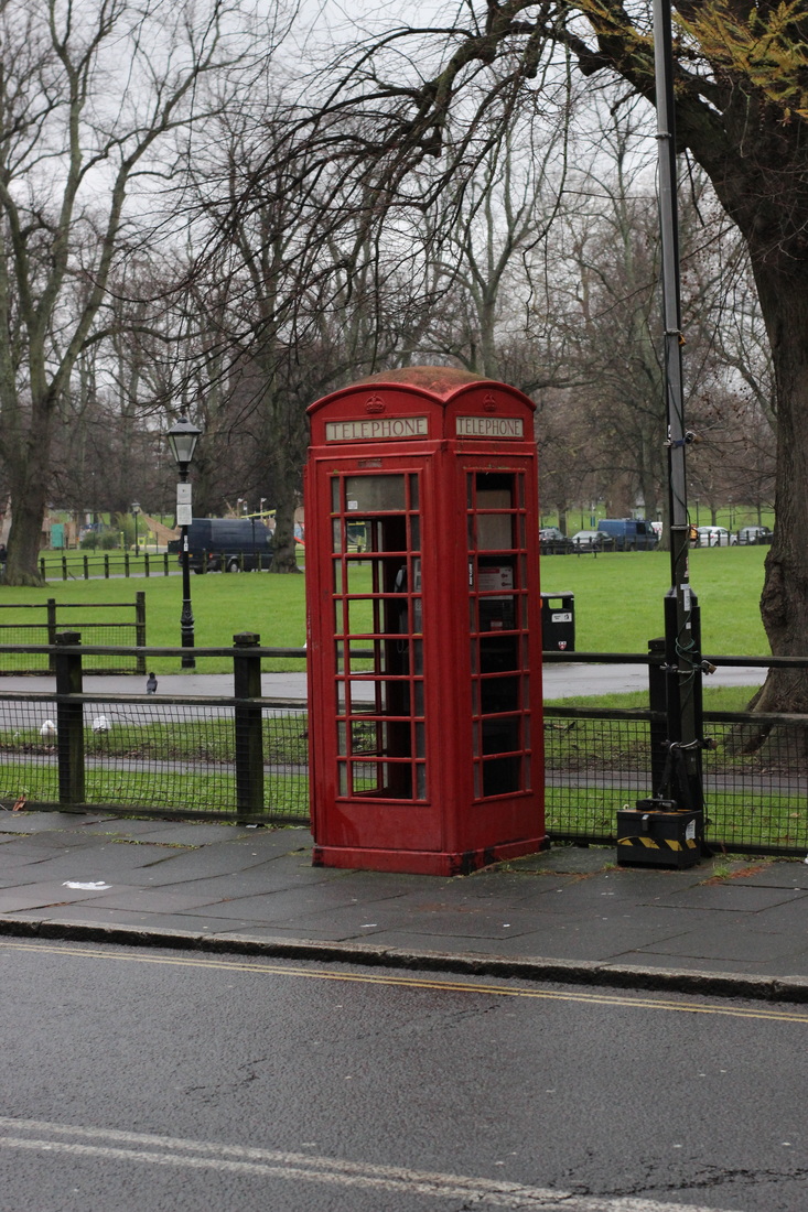
I took a few steps for this:
step one: I used the polygon lasso tool to go around the phone box and then copy and pasted it on to a new layer. step two: once I pasted it onto a new layer I went back to the other layer and put it in black and white. Step three: I adjusted the levels to create a higher contrast in the black and white. |

|

|
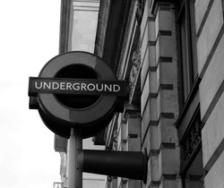
I took a few steps for this:
step 1: I put it in black and white. step 2 I adjusted the levels to make the sign darker than the rest of the image. step 3: I cropped the image to make the composition a bit better. |
|
|
for this image I took two steps:
step 1: I cropped the image to make the composition more desireable. step 2: I put it in black and white so its in the style of Niki Gorick. |
Developing my ideas.
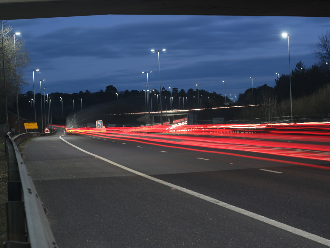
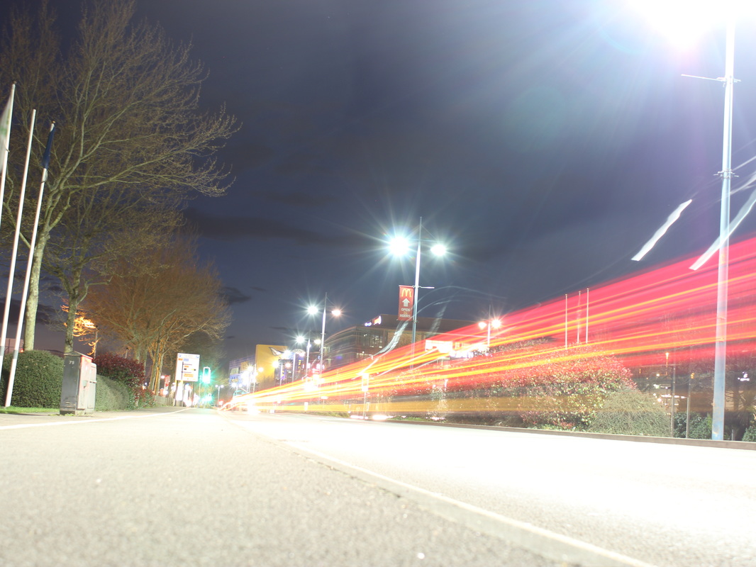
Firstly I wanted to explore light


Best Three.

|

|
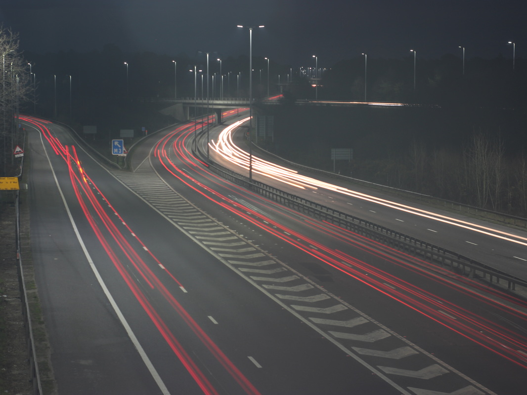
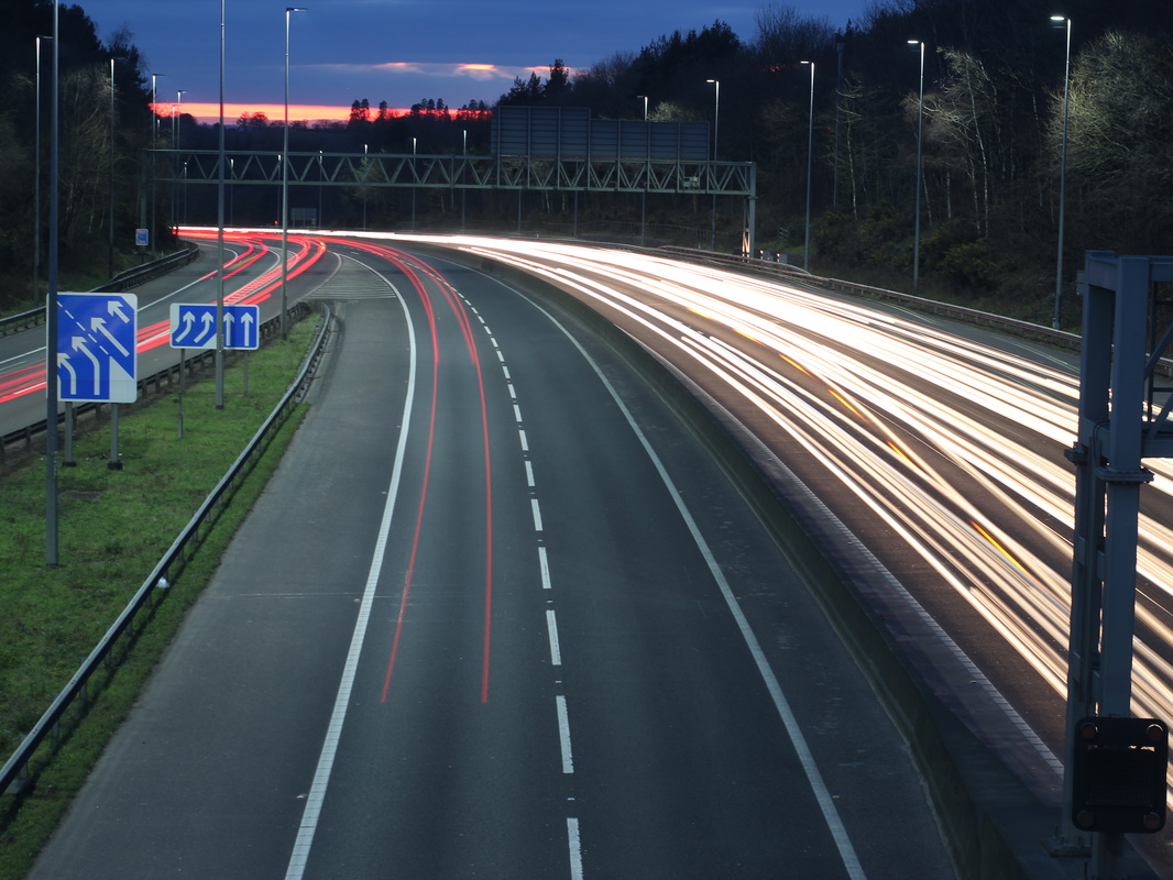
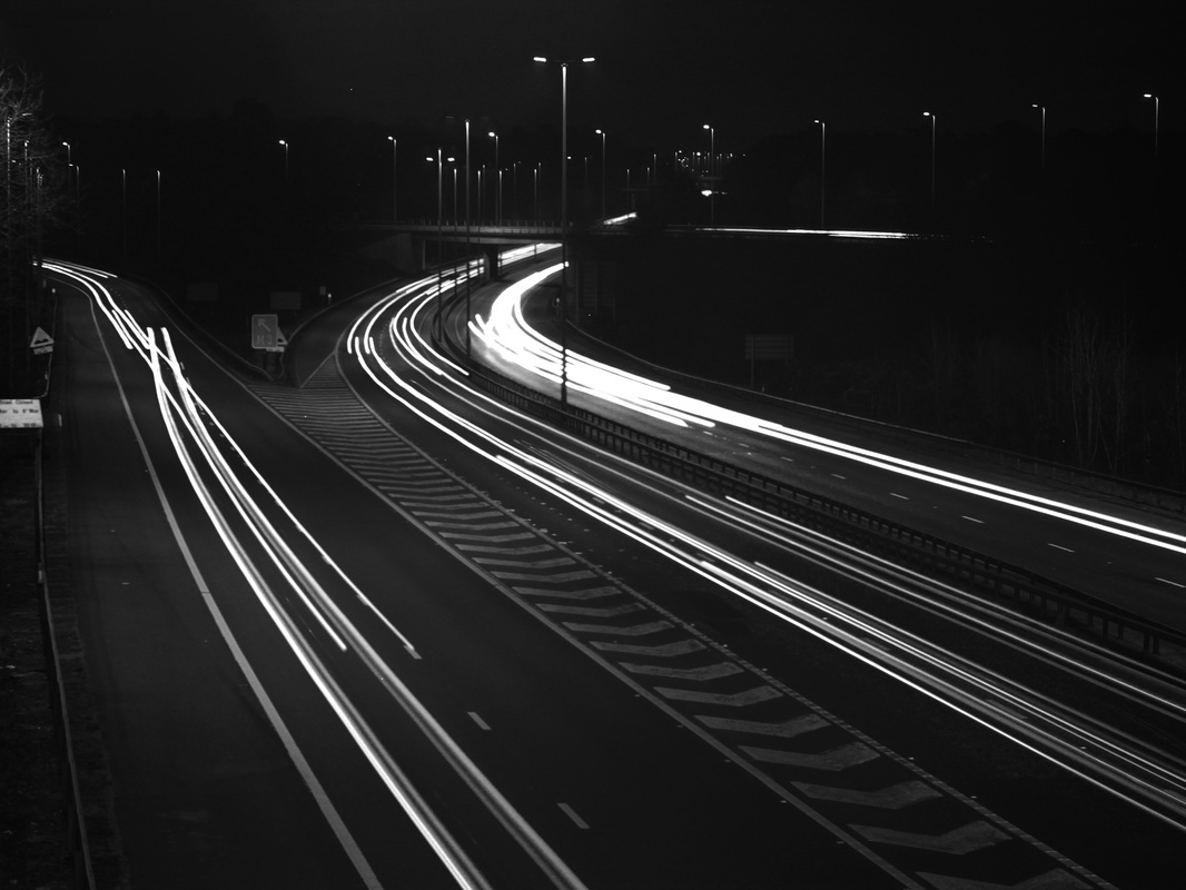
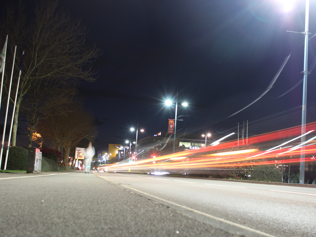
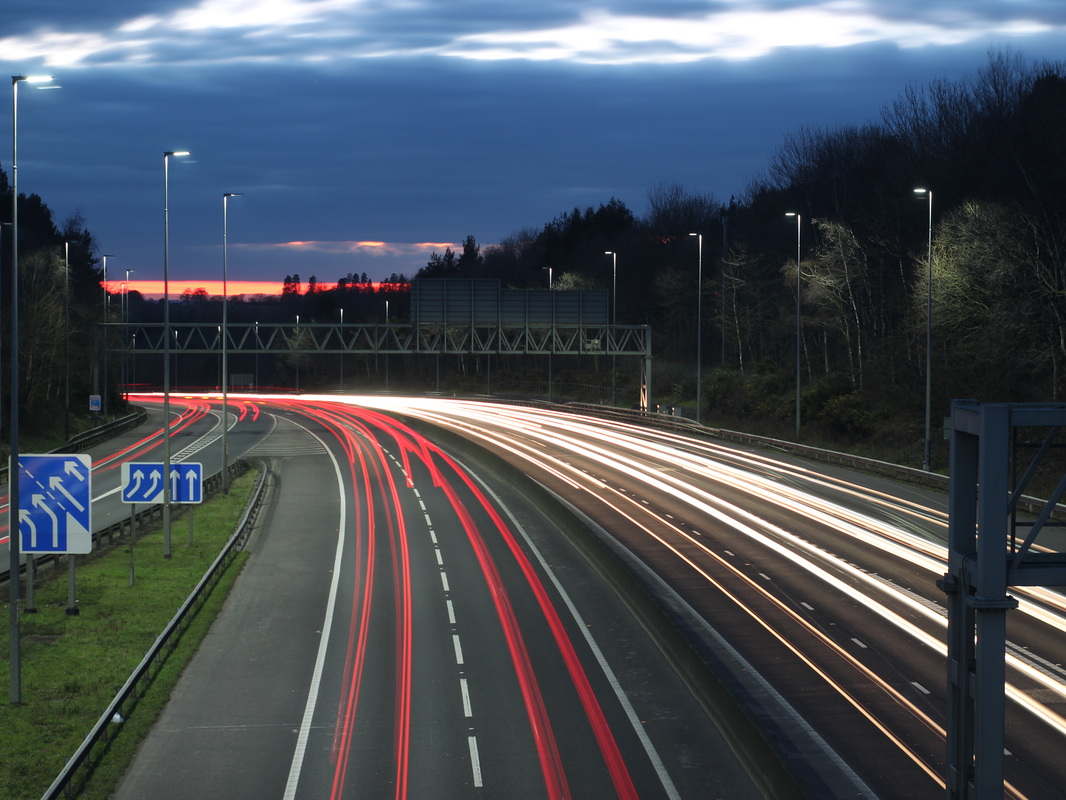
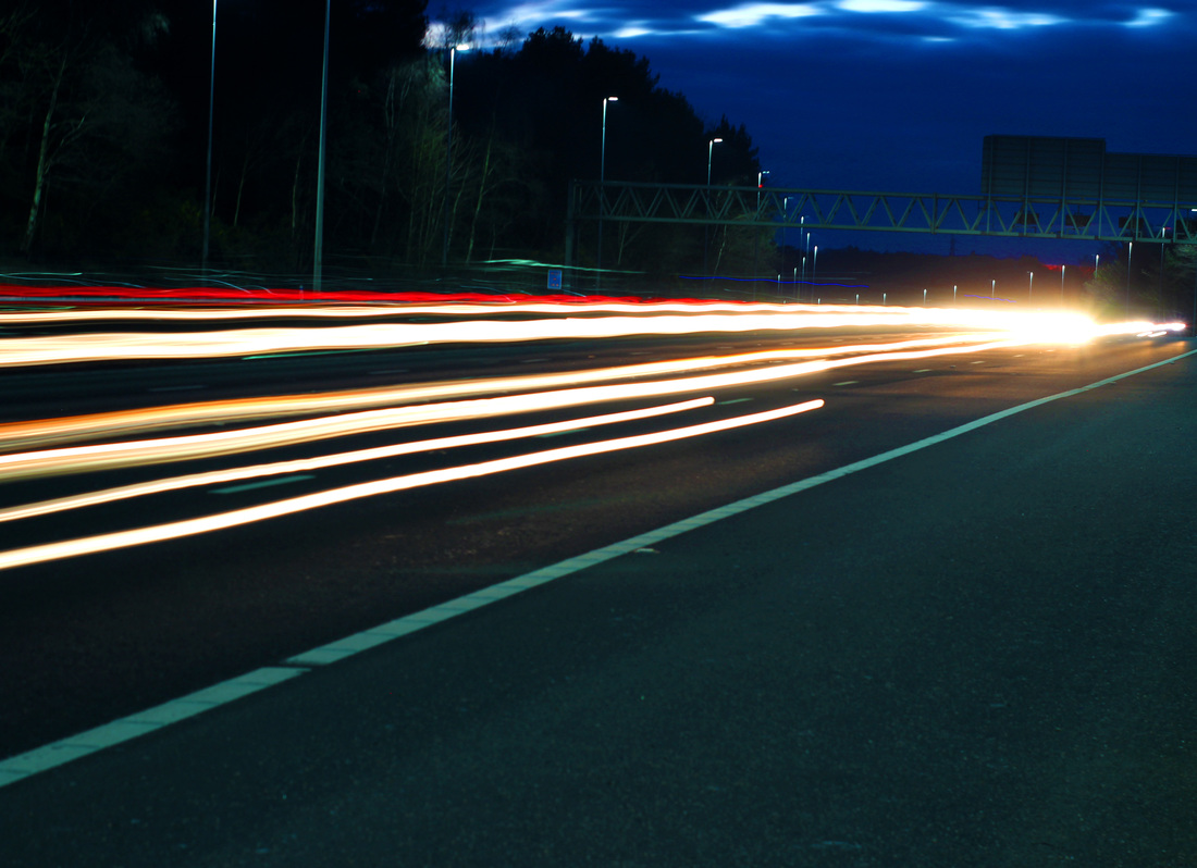
To edit this I took a few steps:
Step 1: I adjusted the levels to make the image darker so the lights stand out more. Step 2: I then cropped the image to adjust the composition slightly. Step 3: I adjusted the vibrancy so the light trails look brighter. |

|
|
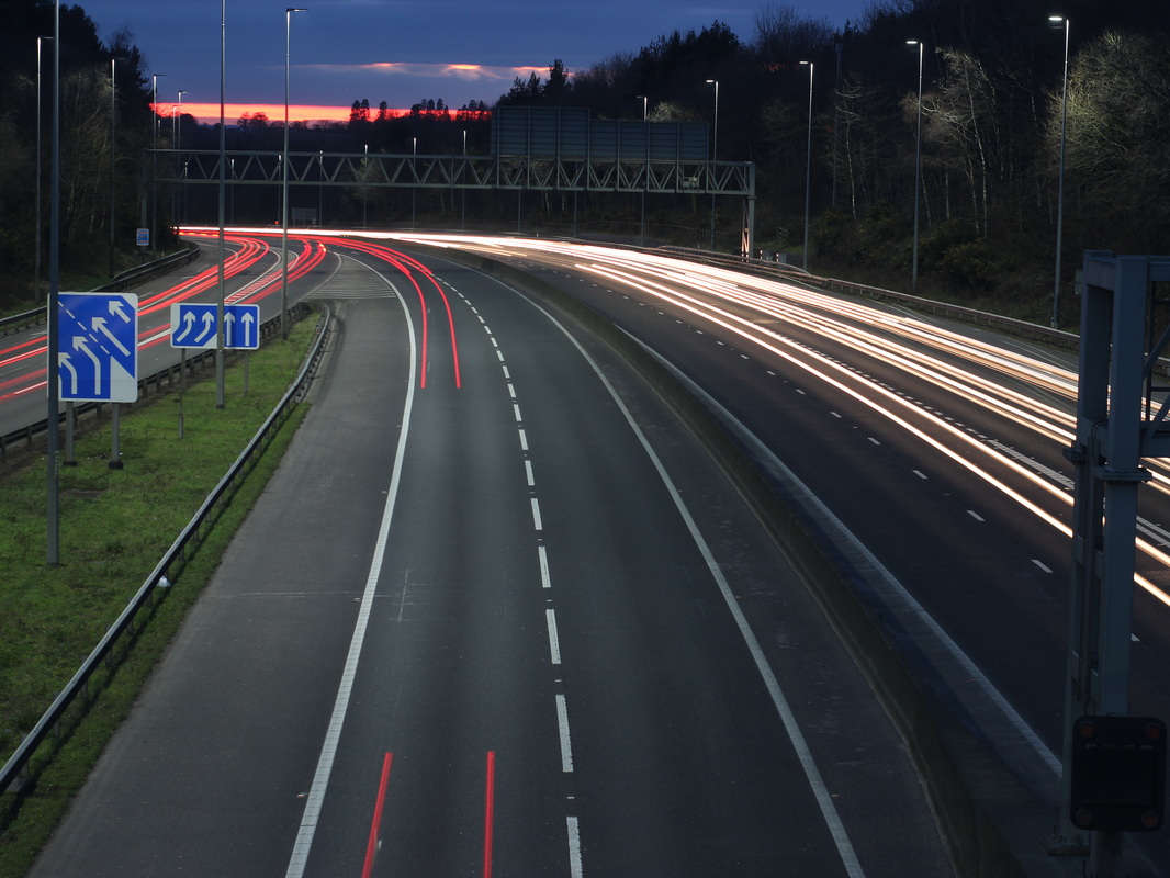
To edit this I took a few steps:
step 1: I adjusted the levels to make the image darker and the light trails stand out more. Step 3: I put the image in black and white to experiment . |

|
|
To edit this I took a few steps:
step 1: I adjusted the levels so the image is darker and the light trails stand out more. step 2: I adjusted the vibrancy so the light trails stood out more from the background. |
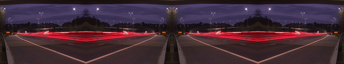
developing my ideas


Best Three

|

|
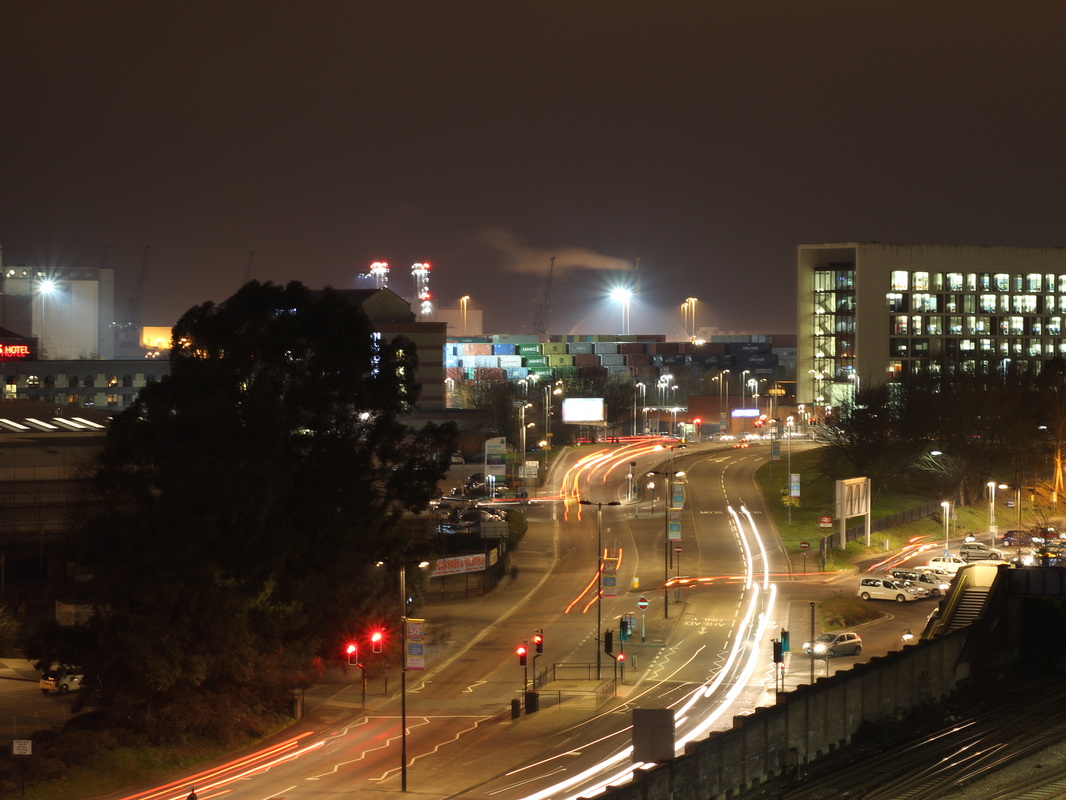
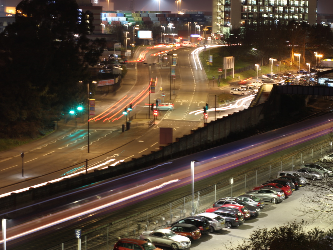
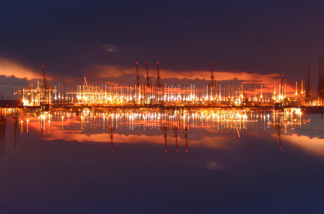
For this image I took a few steps:
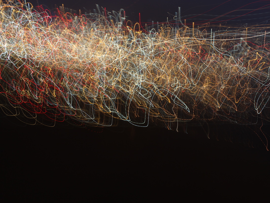
Step1 : I adjusted the levels to make the image darker and the reflected light stand out more. step 2: I adjusted the hue/saturation to adjust the colours. Step 3: Finally I adjusted the colour balance to make the colours of the light more vibrant. For this image I took a few steps:
Step 1: I put a black shape over the image and changed the blend option to overlay to make the image darker and the lines still stay vibrant. step 2: I adjusted the hue and saturation to adjust the bright colours in the image. For this image I took a few steps.
step 1: I cropped the image to adjust the composition and get rid of things I didn't want in the image. step2 : I rotated the image slightly to make the horizon level in the image. step 3:i then adjusted the levels to make the image darker and the lights brighter. |
Experimenting with my ideas.
combining images.

1
|
2
|
|
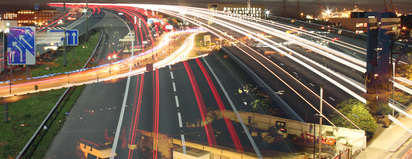
For this image I took a few steps.
step 1: I took the first image and then added a new layer with this layer I took the 2nd image and overlayed. step2 : I then changed the blending option to overlay and adjusted the fill and opacity so you could see the lines from both images. |

1
|
2
|
|
For this image I took a few steps
step one: I took the 2nd image and overlayed it on top of the second image. step two: I then adjusted the blending options so I could have both light trails in each image, I id this so the image looked more abstract. step three: I then adjusted the levels make some parts of the image lighter and darker. |
|
|
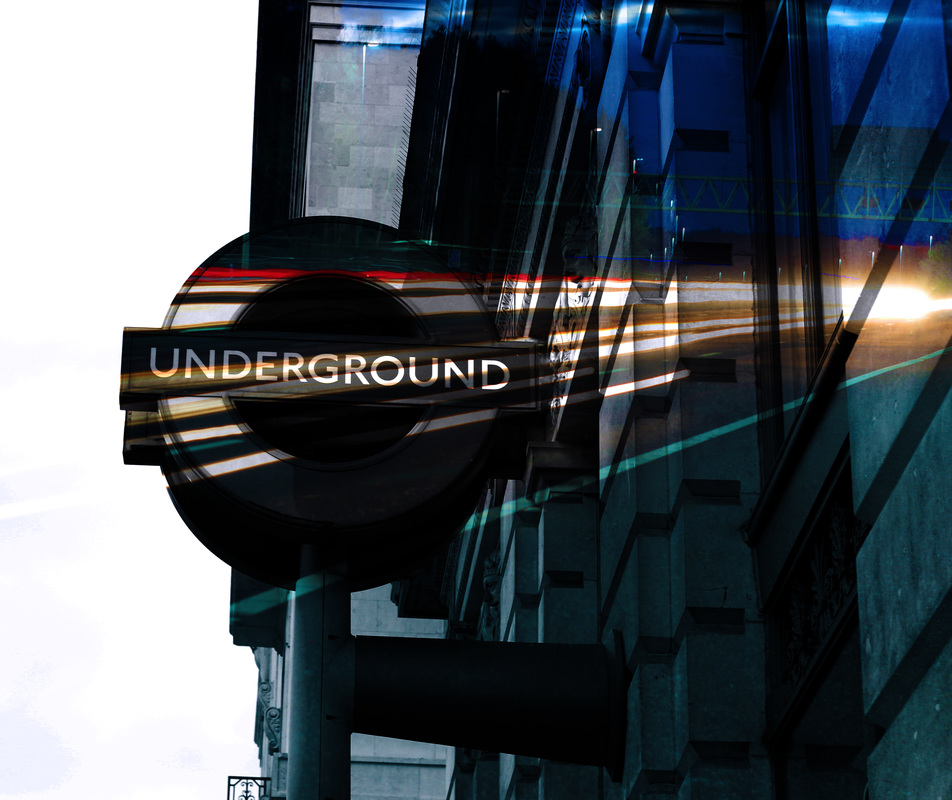
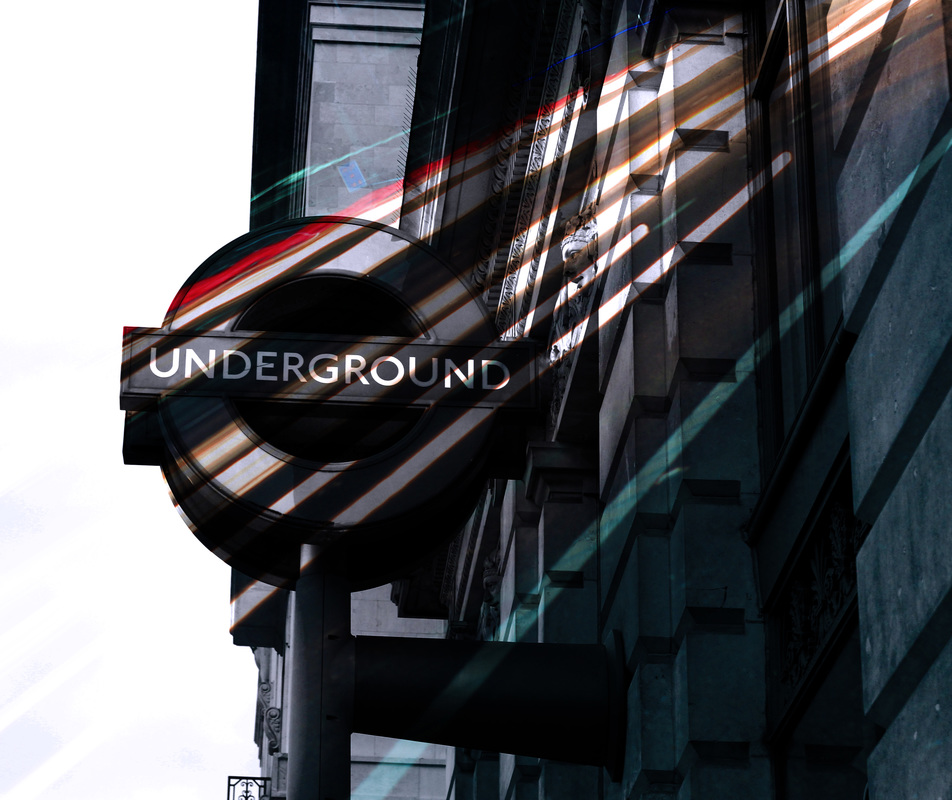
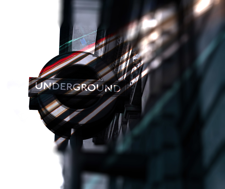
I took a few steps to edit this image:
Step One: I took the second image and overlayed it on top of the first image.
Step Two: I then adjusted the blend option to screen to get the effects of the light trails on the sign.
step 3: I then noticed it would look better if the light was coming from the corner and going onto the sign so I then rotated the image on top to get the final result.
|
|

|

|
|
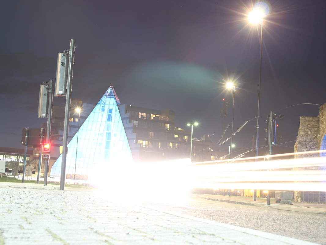
For this image I took a few steps:
step one: I cropped the first image down to just the light trails and then overlayed them on top of the other image. Step Two: I then used the eraser to get rid of the darker bits in-between the light trails. step Three: I adjusted the hue/saturation to change some of the colours of the light trails. step four: Finally I changed the blend option to overlay |
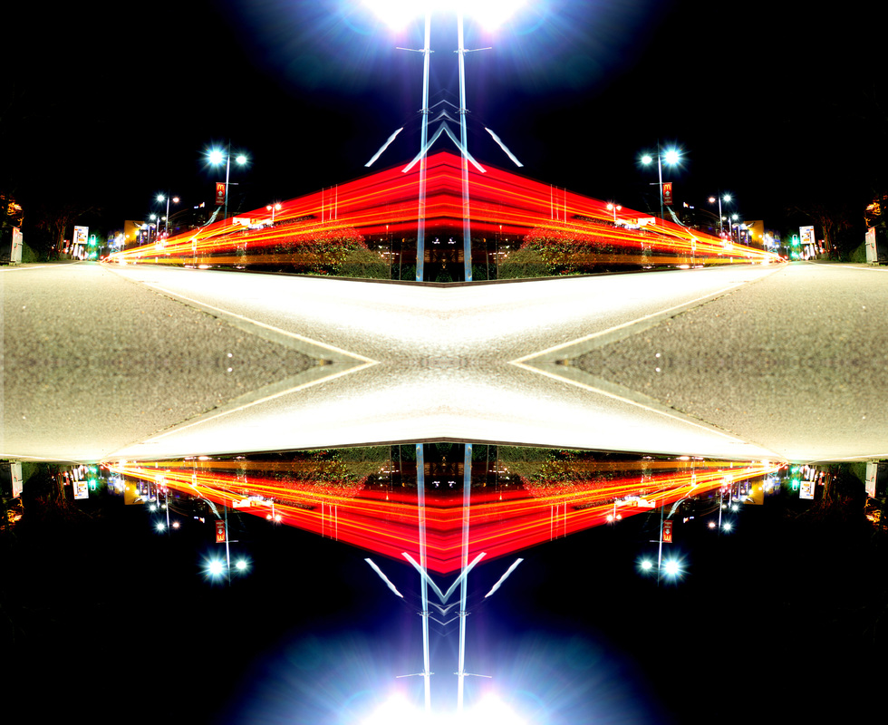
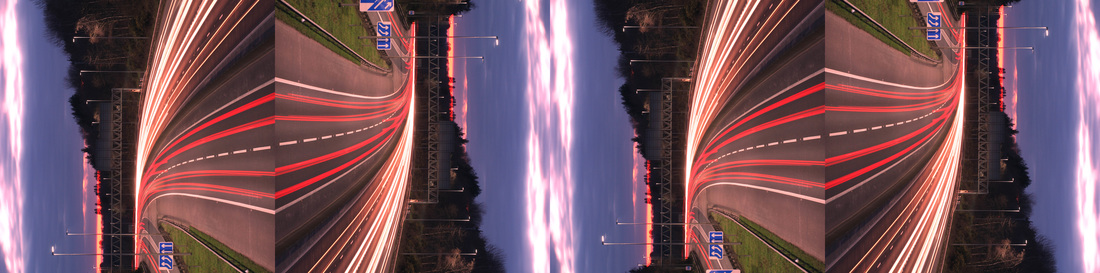
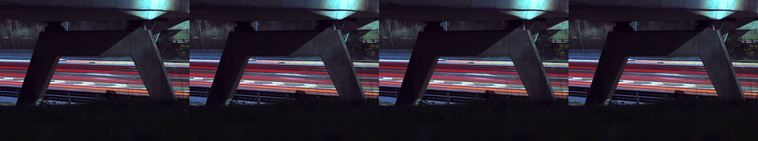
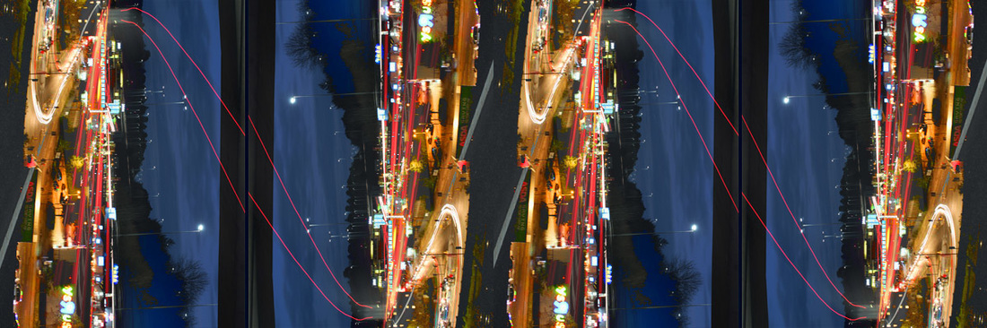
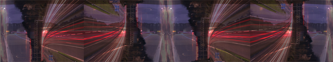
Flipping & Repeating
To do this there are a few steps you need to take.
Step 1: duplicate your image 4 times, each onto a separate layer.
step 2 : increase the canvas size side ways by 400 per cent
Step 3: drag the images out along the canvas.
step 4 : rotate and flip the images until you find a pattern you like..
Step 1: duplicate your image 4 times, each onto a separate layer.
step 2 : increase the canvas size side ways by 400 per cent
Step 3: drag the images out along the canvas.
step 4 : rotate and flip the images until you find a pattern you like..

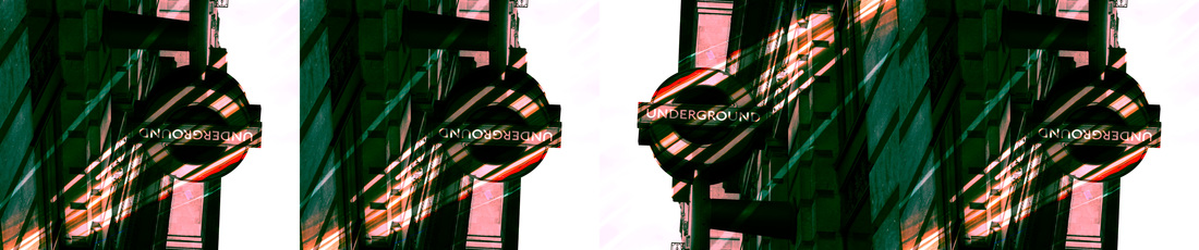
Flipping and Repeating Combined images.
To get these results I took the images I had previously combined and took the same idea of flipping and repeating so that they link together nicely. For this I used the same technique as just flipping and repeating.


Refining my ideas.
These are my favourite images of this project. All of these images link together, every image has vibrant lights in.


Exploring the link.

|
|
for this image I took a few steps.
step 1: I took the first image and cropped it down to just the horizon. step 2: I then scaled the image so the horizon was larger. step 3: I copied the image and flipped it over to get the reflection like image. |

|

|
I took a few steps to edit this.
step 1: I took one image and overlayed it on top of the other.
step 2: changed the blend option to overlay and changed the opacity.
step 1: I took one image and overlayed it on top of the other.
step 2: changed the blend option to overlay and changed the opacity.


|

|
For this image I took a few steps.
Step 1: I adjusted the vibrancy to emphasise the brightness of the light to show the links. step 2: I added an iris blur to blur some of the lines but not all of the lines and to keep the lines on the sign the main focus. For this image I took a few steps.
step 1: I took the lines image and cropped it down to just the lines. step 2: I copied onto the bridge image and placed it onto to the sea. step 3: I changed the blend option to overlay to get this result. |
Final Piece


Evaluation.
I began this project by researching a variety of artists and photographers who expressed the theme of landmarks. I particularly responded to the work of Rut Blees Luxemburg , Polly Braden and Niki Gorik, Their images are imaginative and skilful and I was keen to explore how they captured light in the urban landscape. I have explored a range of processes and techniques in this project including overlaying , repeating and reflecting images. I have refined my work in various ways. For example repeating them in different ways, overlaying them in various ways and reflecting them in different angles and colours. I found the technique of overlaying challenging and it took me a long time and plenty of patience to make real progress. I am pleased with my final outcomes because they represent how I feel about the theme of landmarks. I have chosen to display them in this particular way because I was inspired by the photographers I studied. If I had more time I would like to explore the theme of landmarks in even more detail by experimenting with different light patterns.
